Showing posts with label Sketch For You To Try-SFYTT. Show all posts

My First Christmas Card of the Season

Thursday, August 30, 2012

Time to get started on Christmas cards!
Actually, I didn't intend to make a Christmas card today, but I saw the St. Nick image and went with it. I used a Snow Marker around the edges of the image, then added a little Diamond Stickles on top of that. All my paper on this card is digital.


For the card layout, I used the August 2012 Sketch For You to Try, and the color palette came from the ColourQ Challenge #152.

I made the white loopy bloom and tan rose with Die-namics dies. I can't believe I waited so long to get these dies...they are fantastic!


Even though this paper isn't a traditional Christmas design or color, I thought the white paper with the random dots was perfect for a Christmas card. I just wish I'd have turned that dp on the inside, so it looked more like ornaments hanging down. ;)

Thanks for stopping by, and have a great day!

I'd like to enter this card in the following challenges:
Sketch For You to Try: August 2012
Colour Q Challenge: CQC152
Christmas Stampin' All Year Long, CSAYL #25: Non-Traditional Colors
Jingle Belles: JB-12-18: Holiday B-I-N-G-O (Santa, flowers, ribbon)
Creative Card Crew Challenge #18: Christmas
Sentimental Sundays Challenge #117: Sewing or Faux Stitching
Simon Says Stamp: Anything Goes
Stamptacular Sunday Challenge #178: Roses & Ribbons

~Hugs,

 
Stamps: Sentimental Christmas (Flourishes); Dots & Flowers Background (Hero Arts); Santa Image (Magic Moonlight Studio)
Digital Paper: For the Boys, Shine: Karen Funk; Breezy: Karla Dudley (Design House Digital)
Ink: Distress Ink; Memento; Snow Marker
Dies: Mini Royal Roses, Loopy Blooms, Royal Leaves (MFT Stamps); Curved Rectangle (Spellbinders)
Accessories: Designer Pine punch (McGill); twine; burlap; felt; acrylic paint; Stickles; sewing thread; leaf pins; flowers
Size: A2 (4.25" x 5.5")
Thanks for visiting my blog!
To have Ink Up delivered to your inbox,
subscribe in the box at the top right of the page.

New Look, Spooky Tree, and a Gizmo Thing

Monday, September 5, 2011

Hello Friends! I hope you had a great weekend (here in the U.S., it may still be a weekend for you for the Labor Day holiday, so continue to enjoy)! I haven't posted anything in a couple of days because I spent the weekend changing the look of my blog and also celebrating my 12th anniversary with my husband.  

When I first began my blog, I designed my background and banner myself, and I was really pleased with it. I still liked how it looked, but lately it had started to feel a little crowded with all the stuff that was on it, and I wanted to widen my posting area anyway, so I decided this was a great time to make a change. When I'm visiting other blogs, my favorites, esthetically, are the ones that have "calmer" backgrounds. My new look is moderately calm. ;)  I hope you like the "new me."

My husband and I celebrated our 12th wedding anniversary this past weekend. We had dinner at the Atlanta Fish Market. If you're in the Atlanta area and haven't been there, it is quite a treat. Thanks for your suggestions on which anniversary card I should give him. I went with the leafy card and he loved it. I showed him all three cards and he said he liked the leafy card best because it was more masculine, but he also liked the grungier card, which is actually my personal favorite.

I talk about making cards all the time, and in one of those conversations I must have mentioned to my husband that I might want to eventually get a Copic airbrush system. Apparently, he was paying attention because he tried to find one at Michael's. He said he described it to them as something that paints and has brushes on it and costs $99. He said no one knew what he was talking about. I don't think I'd have known from that description, either. :D  Well, he finally gave up and when I opened my anniversary card, this fell out:

I was very touched, and I almost don't want to spend the money. I'd like to keep it just like it is. But, of course, I will spend it. I wouldn't want him to think I didn't appreciate the gift! ;~D

Now, on to my card. I was going to make another Christmas card, but since Halloween is just around the corner, I thought I'd try my hand at a "spooky" card. I used the September Sketch For You to Try and played the Flourishes Timeless Tuesday #133 Bingo challenge, using the center vertical row of piercing, pearls, and ribbon. I like how it turned out--a kind of "grown- up" Halloween card.

I stamped the tree with Staz-On ink, then sponged Vintage Photo, Wild Honey, and Faded Jeans inks around it. I used Pumice Stone ink around the inside edge of the circle and Black Soot on the outside edge of the paper. I typed "Happy Halloween" in Word, printed a mirror image onto a transparency and rubbed it onto the tag. The pearls started out as a coppery brown color, but I colored them with a black Copic.

I love the blue and gold strip on the inside of the card. It's the same paper as on the front of the card, but the gold looks metallic here. 

Thanks for stopping by. Have a great week!


Stamps: Haunted Tree (Inkadinkadoo)
Paper: Plentiful-digital paper & Dinner Party-digital paper (Shabby Princess); Vintage Wallpaper-digital paper (Lost and Taken); Best of K&Co; Darice; Recollections
Ink: Tim Holtz Distress Ink; Staz-on; Copic markers
Dies: Std Circles Lg; Nested Lacey Pennants; Curved Rectangles (Spellbinders)
Accessories: Bird Call embossing folder (Cuttlebug); ribbon (Joann); pearls-colored with Copic marker (Studio 112); Corner Chomper; piercing tool; sentiment created in computer, printed on transparency and rubbed on
Size: A2 (4.25" 5.5")
Thanks for visiting my blog!
To have Ink Up delivered to your inbox,
subscribe in the box at the top right of the page.

Grunge Anniversary

Wednesday, August 31, 2011


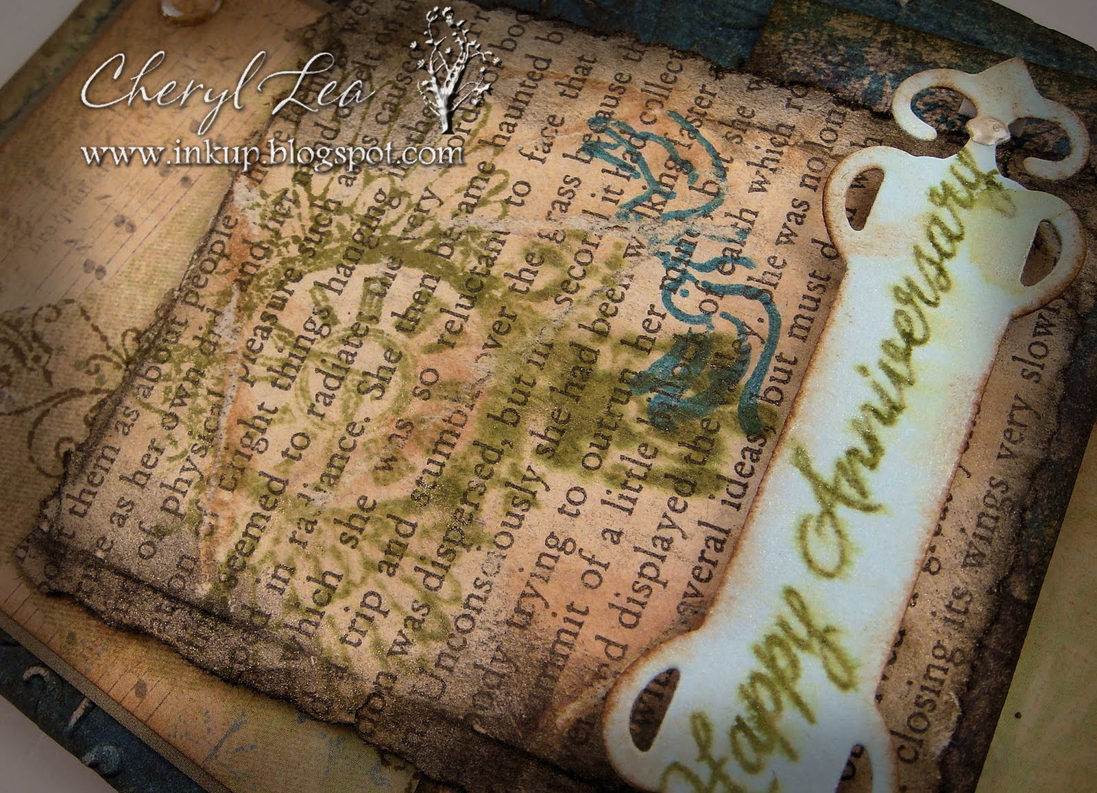
Good morning to you! Today's layout is from iheart2stamp's August Sketch For You To Try.

As you can tell from the post title, this is another anniversary card. My husband and I celebrate our 12th anniversary this coming Saturday and I've been trying to decide what kind of card I want to give him. I'm running out of time, so maybe you can help me at the end of the post. :D

I did some heavy distressing on today's card. The dark teal background paper was already a distressed pattern, then I embossed it, sanded it to expose the white paper, then used a couple of "dirty" inks on the sanded areas and edges. The next layer, with the music notes at the top, started out as a pale green, yellow, and cream paper. I stamped the swirl design along the left side in brown, then used Tea Dye ink on the edges, and a good bit into the paper. The next small horizontal piece only needed black ink on the edges, because the paper is a digital image of vintage wallpaper that was already so distressed it didn't need anything else.


The text layer is a page torn from an old Virginia Woolf novel I had from college. I never could get into her writing, so ripping the book up wasn't too hard for me. ;) I tore all the edges, used several of those dirty inks on it, then glued it to a piece of cardstock to give it some stability. The green stamp is a clock with wings, and the dark teal stamp is of two doves. It still looked too clean when I was done, so I crinkled the whole thing up and went over it again with ink to catch the creases. Then I sprayed Perfect Pearls Mist over it. I hadn't planned on the stamped image of the clock smearing, but after looking at it a little bit, I liked the effect. However, it was just too shiny for a grunge card, so I sanded it in several places, until it looked grungy enough for my taste.


Finally, I cut a fancy tag out of light blue cardstock, distressed the edges of it with ink, and stamped the sentiment on it. I sprayed it with a mist of Perfect Pearls and water, which made the sentiment ink smear, but this time I knew it would happen and was pleased. The little silvery dots on the ends are Liquid Pearls.

The inside of the card is just lightly distressed, with a simple Quietfire sentiment. I love that elegant font.


Now, my only problem is to decide which card I want to give him. I'm leaning toward today's grunge card, because I LOVE that style, but the leafy card seems a little more masculine, maybe, and classy. I like the brown digi paper card, but those big brown polka dots kind of turned it into a girly card, I think. What about you? Which card would you go with?  
Grunge card

Leaf card
  
Brown Digi Paper card
Thanks for stopping by and for your help. *~D  Have a fantastic day!
 
Stamps: Daily Junque (Pink Paislee); Quietfire; Everyday Sayings (Hero Arts); Wedded Bliss (Creative Imagination)
Paper: Spontaneous Delight (Shabby Princess, digital); Best of K&Co; Vintage Wallpaper (Lost and Taken, digital); Faith paper pack (The Paper Studio); Bazzill Basics; old book page
Ink: Tim Holtz Distress Ink; Colorbox
Dies: Fancy Tags & Curved Rectangles (Spellbinders)
Accessories: Love is in the Air embossing folder (Cuttlebug); Mini Round Gems (Recollections); Perfect Pearls; Perfect Pearls Mist; Liquid Pearls
Size: A2 (4.25" x 5.5")
Thanks for visiting my blog!
To have Ink Up delivered to your inbox,
subscribe in the box at the top right of the page.

Celebrate summer

Sunday, July 10, 2011

Hi there, blog friends! We'll be spending a few days visiting The Mouse in Orlando next week, so here's one more post before we go. It takes care of two challenges: the July Sketch for You to Try, over at iheart2stamp; and the Crazy 4 Challenges summer theme challenge. I live in the deep south and summers here can be HOT! I'm a very cold-natured person (80-85 degrees is probably my ideal temperature range), so summer is my favorite time of the year, and normally, I would think of a summer-themed card as one with lots of vibrant colors, maybe a pool or beach scene, kids playing--something along those lines. Well, this weekend I took my daughter to a pool party. It was 102 degrees and I don't swim, so I was outside in that heat for over two hours. It was almost unbearable, even in the shade, even for me. Let me tell you, I wasn't feeling those fun, bright colors...I was feeling hot--white hot! So, when I decided to make the summer-themed card, I thought about the way a blazing, hot sun can make everything look a little washed out. The color is still there and just as beautiful, but muted through the glare. So, here's my idea of summer today.

The card says "Celebrate Summer." It's hard to see it in a photo, so here's a close up. Not sure that's much better, but it shows off the iridescence on the butterfly, too, so I'm going with it anyway ;)
I really enjoyed making this card. I love layers, and this sketch has plenty. The Prima paper was an easy choice. Lots of bright colors, but with the watercolor effect, they weren't too bright. My original intention was to use plain white paper for most of the card, maybe with just a hint of texture. But, it needed a little bit of oomph if it was going to sit right next to that happy Prima paper, so I pulled out my embossing folders. I think it's the first time I've used either of these particular folders and they look so good together. I'm sure I'll be going back to them again soon. Also, I had started out wanting everything but the dp and embellishments to be solid white, but the embossing was so pretty I wanted to show it off so, I sponged Spun Sugar Distress Ink over it.

Buttons were an obvious option for the three circles on the sketch. The flowers caught my eye, and the colors were a match, so I glued them on. It took me a little while to decide what to do on the sentiment panel. I didn't want a big empty space next to the sentiment and I couldn't get ribbon and bows to cooperate, so I punched a butterfly and it fit pretty good. I wanted just a little bit of shine on the card, so an iridescent butterfly and a few pearls seemed to fit the bill, just fine. I have some pots of Perfect Pearls, but the only thing I've ever used them for is to mix with water and reinkers to make my own mists, so I wasn't exactly sure what to do with them. My first attempt to cover the butterfly was to ink Perfect Medium over the butterfly, then brush the Perfect Pearl powder over that. I don't know if I did something wrong, but the powder never would stick. So, I went to the trusty web for guidance. I ended up mixing the powder with a little water and painted it on. It turned out so pretty. The butterfly looks like it was punched from a sheet of pink copper.

Hope that wasn't too much on the process, but I like knowing how other people "figure out" their cards and thought you might, too.

Thanks for stopping by!  I won't be posting for a few days, so have a great week!!!
 
Stamps: Everything Happy (Stampendous)
Paper: Fairy Flora (Prima); Darice; Recollections
Ink: Tim Holtz Distress Ink
Accessories: Diamonds in Diamonds & Tropical Paisley embossing folders (Sizzix); embossing powder (Zing); Monarch Butterfly Lg punch (Martha Stewart); Crop-a-dile Corner Chomper; Perfect Pearls; buttons, pearls, mini roses (Recollections); dimensionals
Size: A-2 (4.25" x 5.5")
Thanks for visiting my blog!
To have Ink Up delivered to your inbox,
subscribe in the box at the top right of the page.