
 Good morning to you! Today's layout is from iheart2stamp's August Sketch For You To Try.
 As you can tell from the post title, this is another anniversary card. My husband and I celebrate our 12th anniversary this coming Saturday and I've been trying to decide what kind of card I want to give him. I'm running out of time, so maybe you can help me at the end of the post. :D
I did some heavy distressing on today's card. The dark teal background paper was already a distressed pattern, then I embossed it, sanded it to expose the white paper, then used a couple of "dirty" inks on the sanded areas and edges. The next layer, with the music notes at the top, started out as a pale green, yellow, and cream paper. I stamped the swirl design along the left side in brown, then used Tea Dye ink on the edges, and a good bit into the paper. The next small horizontal piece only needed black ink on the edges, because the paper is a digital image of vintage wallpaper that was already so distressed it didn't need anything else.

The text layer is a page torn from an old Virginia Woolf novel I had from college. I never could get into her writing, so ripping the book up wasn't too hard for me. ;) I tore all the edges, used several of those dirty inks on it, then glued it to a piece of cardstock to give it some stability. The green stamp is a clock with wings, and the dark teal stamp is of two doves. It still looked too clean when I was done, so I crinkled the whole thing up and went over it again with ink to catch the creases. Then I sprayed Perfect Pearls Mist over it. I hadn't planned on the stamped image of the clock smearing, but after looking at it a little bit, I liked the effect. However, it was just too shiny for a grunge card, so I sanded it in several places, until it looked grungy enough for my taste.
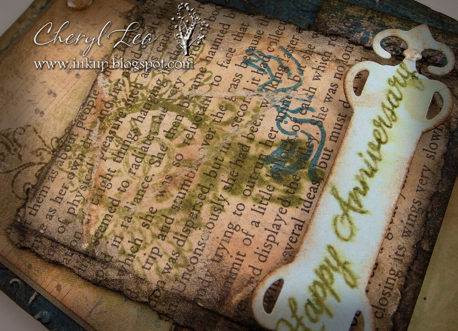
Finally, I cut a fancy tag out of light blue cardstock, distressed the edges of it with ink, and stamped the sentiment on it. I sprayed it with a mist of Perfect Pearls and water, which made the sentiment ink smear, but this time I knew it would happen and was pleased. The little silvery dots on the ends are Liquid Pearls.
The inside of the card is just lightly distressed, with a simple Quietfire sentiment. I love that elegant font.

Now, my only problem is to decide which card I want to give him. I'm leaning toward today's grunge card, because I LOVE that style, but the leafy card seems a little more masculine, maybe, and classy. I like the brown digi paper card, but those big brown polka dots kind of turned it into a girly card, I think. What about you? Which card would you go with?
 |
| Grunge card |
 |
| Leaf card |
 |
| Brown Digi Paper card |

Paper: Spontaneous Delight (Shabby Princess, digital); Best of K&Co; Vintage Wallpaper (Lost and Taken, digital); Faith paper pack (The Paper Studio); Bazzill Basics; old book page
Ink: Tim Holtz Distress Ink; Colorbox
Dies: Fancy Tags & Curved Rectangles (Spellbinders)
Accessories: Love is in the Air embossing folder (Cuttlebug); Mini Round Gems (Recollections); Perfect Pearls; Perfect Pearls Mist; Liquid Pearls
Size: A2 (4.25" x 5.5")
Thanks for visiting my blog!
To have Ink Up delivered to your inbox,
subscribe in the box at the top right of the page.
4 comments :
My vote is for the leaf card :) They are both beautiful, of course, but I like the saying on the inside of the leaf one! Great job, girlie! Keep it up!
I think all three look wonderful, but my favorite is the Leaf card. I love the embossed leaves and distress inks. :)
Happy Anniversary!
Cheryl, these cards are all fabulous. I love the grunge card. I think they are all wonderful, there's just something about the background color. It's gorgeous.
I think all three are fabulous! I cannot decide which one is my fav because I truly LOVE all of them! Love your style! You are such an inspiration! Take care!!:-))
Post a Comment