Showing posts with label Quietfire. Show all posts

Openings in Heaven

Sunday, June 22, 2014

Oh my Gosh! I was shocked to see that I haven't posted in 2 weeks! This summer is just flying by. And, as usual lately, I'm short on time, so this will be brief.

Our community recently lost a young man in a tragic accident. Cody owned the lawn company that has been maintaining our yard, as well our neighborhood's common areas for the past five or six years. I literally never saw him without a big smile on his face. The day he told us about his new fiance, he was practically walking on air, he was so happy. He was also kind, honest, fair, and hardworking, and he has left behind his young wife of just 3 years and a six-month old baby girl. Such a sad, sad loss. I made this card for our neighborhood to send to the family.
The dark purple die cut is cut from a piece of purple foil. It was about the thickness of an aluminum can (maybe even thicker), and it was difficult to cut, but after embossing, it was really pretty. I stamped the sentiment twice--first in lavender, then over that, offset just a bit, in a dark purple, achieving a shadow effect. The crystals are Swarovski.


The green color inside the die cuts on the front and inside of the card was airbrushed with a Copic. I took the Copic Airbrushing class last weekend, and it has made a world of difference in my airbrushing skills. I highly recommend that class to anyone who wants to airbrush with their Copics.

Thanks for stopping by, and have a wonderful week!

I'm entering this card in the following challenges:
Simon Says Stamp Monday: Anything Goes
613 Avenue Create Challenge #77: Anything Goes w/optional Pink
Curtain Call Inspiration Challenge: Sweet Pea
Sugar Pea Designs SPD06 Challenge: Anything Goes

~Hugs,

Supplies Used:

Thanks for visiting my blog!
To have Ink Up delivered to your inbox,
subscribe in the box at the top right of the page.

Mother's Day Butterfly

Tuesday, March 20, 2012

Hi there, Friends! I hope you had a wonderful weekend. I watched my DD climb her first rock wall--a scary adventure for both of us--but she not only did it, she did it twice! I can tell you, I was one proud mama, watching her.

As for cards, I've been working on some projects for future posts, but I took a little time out to make one for fun, and for a few challenges:


Viva la Verve Sketch Challenge: VLVMar2012 Week2
Crazy4Challenges C4C128: use green
Do You Stack Up DYSU63: use your favorite color
Moving Along With the Times #140: Special Lady
Simon Says Stamp: A Bit O' Green


For the sentiment circle, I stamped the sentiment, then the small butterflies, and added Stickles to the butterflies. The pink and white dots are Liquid Pearls. Can you see the small pink flowers stamped on the pink cs? I stamped those in VersaMark ink to get just a hint of design. I didn't want it overpowering the sentiment. The flower stamp came from the Prickley Pear Mini Birds Clear Stamp set.


I used the Prickley Pear Rubber Stamp Butterfly 2 Clear Stamp Set for the sentiment, small butterflies, and large music butterfly. The small butterflies are covered in Stickles. The large butterfly was stamped with Memento ink, then I used Distress Inks to color it, and I spritzed it with Shimmer Spritz for just a little bit of shine. The edges of the butterfly were sponged with Walnut Stain Distress Ink. For the body of the butterfly, I used a gold Pearl Pen. After it was dry, I folded the curved the edges of the wings down a little bit, added a foam dot to the back of each wing, then glued the body to the card and popped the wings up.

The sentiment on the inside of the card is a Quietfire design. The pink flourish and butterflies are from the Butterfly 2 stamp set.

And, that's it for now. Thanks for stopping by, and have a great week!

~Hugs,

Stamps: Butterflies 2 Clear Stamps, Mini Birds Clear Stamps (Prickley Pear Rubber Stamps); A Mother is She (Quietfire)
Paper: This & That (Echo Park); Mariposa Matstack (DCWV)
Ink: Distress Ink; Memento; Colorbox
Dies: Floral Doily Motif (Spellbinders)
Accessories: Textile Texture embossing folder (Cuttlebug); mini round gems (Recollections); flower (Recollections); foam dots; Stickles; Liquid Pearls; Pearl Pen; Shimmer Spritz; sewing thread
Size: A2 (4.25" x 5.5")
Thanks for visiting my blog!
To have Ink Up delivered to your inbox,
subscribe in the box at the top right of the page.

Perhaps...

Monday, January 16, 2012

Hi Blog Friends! A short post here tonight. I needed a sympathy card for a friend, so no challenges, just the card.

Here's a shot at an angle so you can see the layers and a close up of the "metal" bracket, which is cut from chipboard, colored with Distress Ink, spritzed with Perfect Pearls Mist, and has Enamel Accents dots.


I left the inside blank so I could add my own message.

Thanks for stopping by, and have a wonderful week!

~Hugs,
 
Stamps:  Perhaps they are not stars (Quietfire)
Paper: Little Black Dress (Basic Grey)
Ink: Staz-On; Tim Holtz Distress Ink
Dies: Fleur de Lis Rectangles, Labels Four, Parisian Motifs, Foliage, Classic Rectangles (Spellbinders)
Accessories: Damask embossing folder (Sizzix); ribbon; pearls; flower (Recollections); Stickles; Enamel Accents; Perfect Pearls Mist; foam dots; sewing thread
Size: A2 (4.25" x5.5")
Thanks for visiting my blog!
To have Ink Up delivered to your inbox,
subscribe in the box at the top right of the page.

Just For You, Cupcake

Monday, November 28, 2011

Hi there, Blog Friends! How's your week starting off? Aside from the weather turning wet and cold, it was a good day for us. I did, however, realize this morning that I've been neglecting my cardmaking lately, so I'm on a mission to get at least the four Viva la Verve November sketch challenge cards made and posted by tomorrow.

My DD will be going to a birthday party this coming weekend, so my card for the Week 1 sketch is a girly birthday card. I used plenty of sparkly Stickles and Liquid Pearls.


Here's a look at the inside. Still girly, but without the flash.

Thanks for stopping by. See you in a bit, with another Viva la Verve Sketch Challenge card!

~Hugs,
 
Stamps: Cupcake, Happy Birthday (Quietfire); Sweet Treats (Verve); Flower (Studio G)
Paper: Summer Song (My Mind's Eye); The Basics Stack (The Paper Studio); Bright Blossom (S.E.I.); Que Sera Sera (K&Co); Floriade1 (Two Peas in a Bucket-Anita M. Richards)
Ink: Tim Holtz Distress Ink
Dies: Blossom Nestabilities, Standard Circles Lg, Lacy Squares (Spellbinders)
Accessories: Stickles; Liquid Pearls; Colored Pencils (Prismacolor); Sewing Thread
Size: A2 (4.25" x 5.5")
Thanks for visiting my blog!
To have Ink Up delivered to your inbox,
subscribe in the box at the top right of the page.

Friendship with Roses

Saturday, November 19, 2011


Happy Saturday to you! It's the weekend...YAAAHHH! Aren't you glad!


My card today is a Mojo Monday card, for sketch challenge #215.


Here's the card. I just love that dp!

And, here's the inside. 

Thanks for stopping by today, and have a great weekend!!!

~Hugs, 


Stamps: Friendship (Quietfire); Large Plaid Pattern (Hero Arts)
Paper: The Green Stack (DCWV); Sweetness (Pink Paislee); Annalee (Prima); Happily Lost (Lily Bee Design)
Ink: Tim Holtz Distress Ink; clear embossing ink
Accessories: Scallop Dot edge punch; Zing embossing powder; seam binding (Hug Snug); satin ribbon (Joann); flower (Recollections); mini round gems (Recollections); Shimmer Spritz; Liquid Pearls; sewing thread
Size: A2 (4.25" x 5.5")
Thanks for visiting my blog!
To have Ink Up delivered to your inbox,
subscribe in the box at the top right of the page.

Paisley Hope

Sunday, October 16, 2011

 Hello Friends! I hope you are having a wonderful weekend. My DD and I saw Dolphin Tale yesterday, and, Wow!, what a great movie! Makes me want to head down to Clearwater and see Winter in person! The card I want to share with you today fits the theme of that movie--Hope.

The layout I'm using is the Tuesday Morning Sketch #115. This week, they have an inspiration photo of a beautiful paisley tote to go along with the sketch, and for the entire month, you have to use pink somewhere on your card.


Heart Song Inspirations also has a challenge this week to use die cuts and/or a sponged background on your card, so I used a Spellbinders Lacy Square as my sentiment panel.

The papers, from the Best of K&Co stack, were perfect for the TMS inspiration photo. I love the muted colors. To pop up the sentiment layers, I ran scrap cardstock through my paper crimper, cut two squares from it, then glued them together with the crimps running vertically on one square and horizontally on the other. I love doing that when I have something fairly large that I want to pop up. It's really sturdy and lifts it just enough to add dimension, but not so much that you can see underneath it. The metal and rhinestone flower is a brad from Michaels. I found it in a set of metal embellishments at Michaels in their Christmas section. The rhinestones were clear, so I colored them with a Copic marker.

Close ups of the flowers, which I distressed a little with Distress Ink, and the layered scalloped edge borders embellished with Liquid Pearl dots.


On the inside of the card, I used a sentiment from the Verve Stamps Words of Wisdom set, and rounded the corners of the pink cs with my Corner Chomper.

And, that's it for now. Thanks for stopping by, and enjoy the rest of your weekend!

~Hugs,
 
Stamps: Hope (Quietfire); Words of Wisdom (Verve)
Paper: Best of K&Co
Ink: Tim Holtz Distress Ink; Staz-On; Inkssentials clear embossing ink
Dies: Lacy Squares (Spellbinders)
Accessories: Diamond Lace Edge Punch (EK Success); Tim Holtz Distress Embossing Powder; Metal & Rhinestone flower-colored with a Copic marker (Michaels); Corner Chomper; flowers (Recollections); Liquid Pearls
Size: A2 (4.25" x 5.5")
Thanks for visiting my blog!
To have Ink Up delivered to your inbox,
subscribe in the box at the top right of the page.

Crazy for you

Friday, September 23, 2011


Hello Friends, and TGIF! Do people even say "TGIF" anymore? Am I dating myself? LOL!


I had more fun making this card today than any card I've ever made. It's as different as is possible from the last card I made that was inkless, crisp, bright, and clean. I'm not sure if you'd call this card grunge, shabby, or vintage, but whatever it is, I believe I've finally found my "style." Maybe I should call this "Kitchen Sink" style. On this card, I distressed with ink and a Distrezz-it-all, used my sewing machine, embossed and inked the raised areas, made a ribbon ruffle, used twine, paper pierced, used Liquid Pearls, Enamel Accents, eyelets, half pearls, and a metal charm, and made a "metallic" hinge out of cardstock and Perfect Pearls Mist. Here are a few close ups before I show you the whole card.

I used a page from an old dictionary for my sentiment stamp. First I aged it with Walnut Stain and Tea Dye Distress Inks and Distrezzed the edges. If you look closely, you can see the paper piercing. It's a little hard to see because the paper is so busy, but it's there. Then I used Black Soot Distress Ink and a Quietfire stamp for the word, "Love." To distress it even further, I spritzed the stamped image with water to make the ink run. I drew the swirl by hand and put the half pearls on one at a time (I don't have ready-made swirls yet). I adhered this to a Beaded Circle die cut which I had inked while still in the die. I used Liquid Pearls in each of the "beads." I finally learned how to use the stuff, and all my dots actually turned out round this time instead of blobby. 8~D

In this picture you can see the embossed strip. I used three different color Distress Inks to ink the raised areas, starting with the darkest color on the outside and working to the lightest on the inside. I attached four large copper-colored eyelets to the top of the strip and tied a metal charm to it by running twine through two of the eyelets. You can only see a smidgen of the ruffle that is sewn to the bottom of the embossed strip. I made it by folding a length of ribbon in half lengthwise and gathering it with basting, then sewing it to the cardstock.

You can see the edge of the faux metal hinge in this photo in the lower left corner. I misted it heavily with Perfect Pearls Mist and dried it with my heat gun, then added four dots of black Enamel Accents. See that loose thread at the top of the photo? I did that on purpose. I stopped sewing there, pulled the thread out of my sewing machine and continued stitching to the end of that edge so that it would look like the stitching had come loose. The top of those panels are distressed the heaviest, so it made sense to me to have loose threads there.


And, here's the finished card. See the stitching on the outer edges? I kept changing from a straight stitch to a zig zag and back to straight as I went around the card, and when zig zagging, I randomly changed the length and width of the stitches to add just a little more shabbiness. 

On the inside of the card, I layered up different papers from the front of the card. If they look a little crooked, it's because they are. I purposely tilted the two middle panels just a tiny bit. The bottom and top panels are both straight and fairly centered (I seldom measure--I just eyeball things. I figure if it looks right to me, it will look right to anyone else, unless, of course, they are going to get a ruler out to check).  ;D I'm not sure why I couldn't bring myself to make all the panels be straight. I fiddled around with it for quite a while and just was not liking it all proper looking.

So just what IS this style? I don't have a clue. But, I sure had a blast making it!

Thanks for stopping by! I hope you've got a wonderful weekend ahead of you.

~Hugs,
 
Stamps: Quietfire
Paper: Once Upon a Time (DCWV); Que Sera Sera (K&Co); old dictionary page
Ink: Tim Holtz Distress Inks
Dies: Beaded Circles, Std Circles Large, Lattice Pendant, Lattice Rectangles, Curved Rectangles (Spellbinders)
Accessories: Tropical Paisley embossing folder (Sizzix); ribbon (Michael's); embossed metal charm (Making Memories); Enamel Accents (Inkssentials); Liquid Pearls; half pearls; large eyelets; household twine; Perfect Pearls Mist; sewing thread; foam dots; Distrezz-it-all
Size: A2 (4.25" x 5.5")
Thanks for visiting my blog!
To have Ink Up delivered to your inbox,
subscribe in the box at the top right of the page.

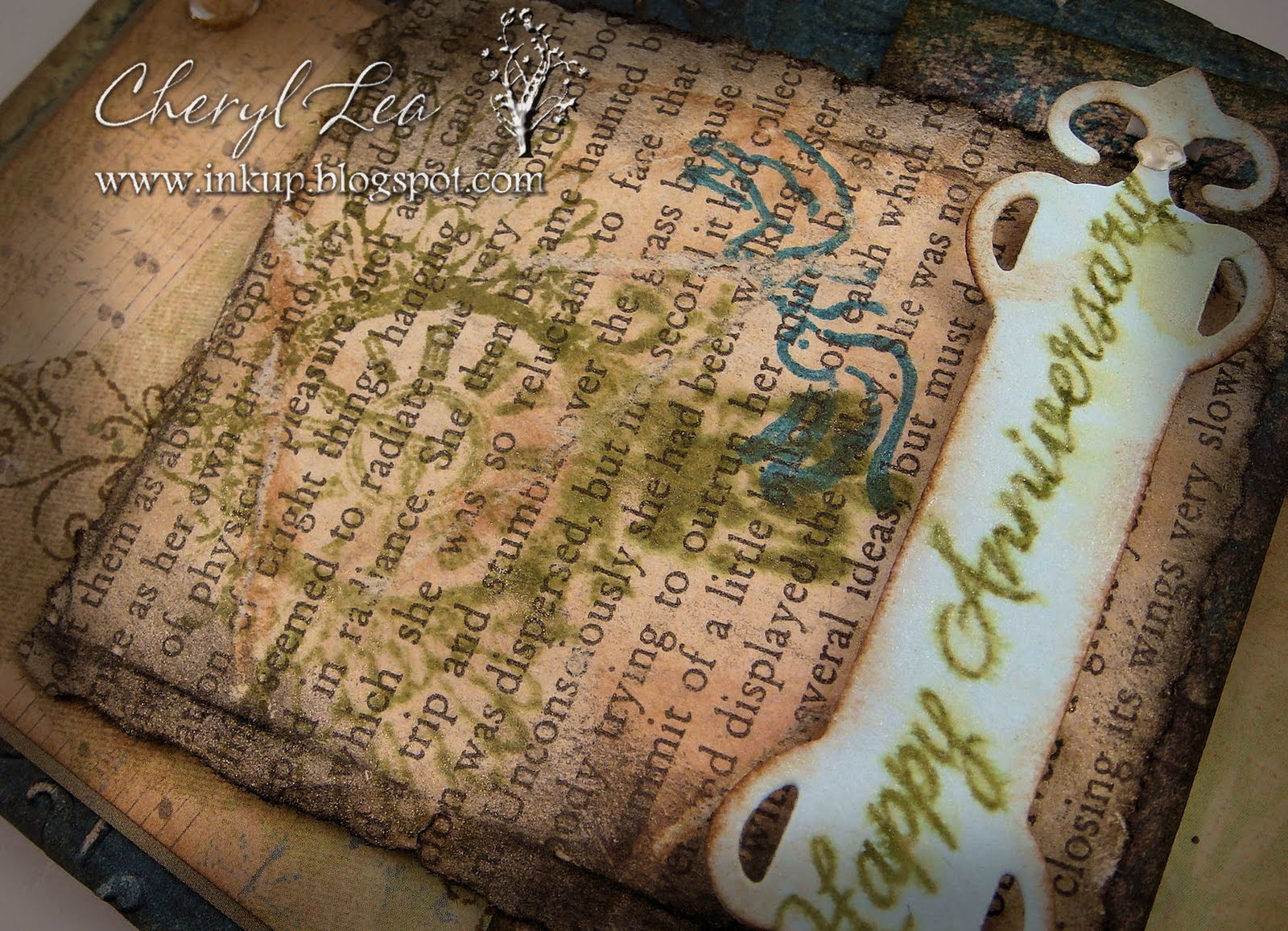
Grunge Anniversary

Wednesday, August 31, 2011


Good morning to you! Today's layout is from iheart2stamp's August Sketch For You To Try.

As you can tell from the post title, this is another anniversary card. My husband and I celebrate our 12th anniversary this coming Saturday and I've been trying to decide what kind of card I want to give him. I'm running out of time, so maybe you can help me at the end of the post. :D

I did some heavy distressing on today's card. The dark teal background paper was already a distressed pattern, then I embossed it, sanded it to expose the white paper, then used a couple of "dirty" inks on the sanded areas and edges. The next layer, with the music notes at the top, started out as a pale green, yellow, and cream paper. I stamped the swirl design along the left side in brown, then used Tea Dye ink on the edges, and a good bit into the paper. The next small horizontal piece only needed black ink on the edges, because the paper is a digital image of vintage wallpaper that was already so distressed it didn't need anything else.


The text layer is a page torn from an old Virginia Woolf novel I had from college. I never could get into her writing, so ripping the book up wasn't too hard for me. ;) I tore all the edges, used several of those dirty inks on it, then glued it to a piece of cardstock to give it some stability. The green stamp is a clock with wings, and the dark teal stamp is of two doves. It still looked too clean when I was done, so I crinkled the whole thing up and went over it again with ink to catch the creases. Then I sprayed Perfect Pearls Mist over it. I hadn't planned on the stamped image of the clock smearing, but after looking at it a little bit, I liked the effect. However, it was just too shiny for a grunge card, so I sanded it in several places, until it looked grungy enough for my taste.


Finally, I cut a fancy tag out of light blue cardstock, distressed the edges of it with ink, and stamped the sentiment on it. I sprayed it with a mist of Perfect Pearls and water, which made the sentiment ink smear, but this time I knew it would happen and was pleased. The little silvery dots on the ends are Liquid Pearls.

The inside of the card is just lightly distressed, with a simple Quietfire sentiment. I love that elegant font.


Now, my only problem is to decide which card I want to give him. I'm leaning toward today's grunge card, because I LOVE that style, but the leafy card seems a little more masculine, maybe, and classy. I like the brown digi paper card, but those big brown polka dots kind of turned it into a girly card, I think. What about you? Which card would you go with?  
Grunge card

Leaf card
  
Brown Digi Paper card
Thanks for stopping by and for your help. *~D  Have a fantastic day!
 
Stamps: Daily Junque (Pink Paislee); Quietfire; Everyday Sayings (Hero Arts); Wedded Bliss (Creative Imagination)
Paper: Spontaneous Delight (Shabby Princess, digital); Best of K&Co; Vintage Wallpaper (Lost and Taken, digital); Faith paper pack (The Paper Studio); Bazzill Basics; old book page
Ink: Tim Holtz Distress Ink; Colorbox
Dies: Fancy Tags & Curved Rectangles (Spellbinders)
Accessories: Love is in the Air embossing folder (Cuttlebug); Mini Round Gems (Recollections); Perfect Pearls; Perfect Pearls Mist; Liquid Pearls
Size: A2 (4.25" x 5.5")
Thanks for visiting my blog!
To have Ink Up delivered to your inbox,
subscribe in the box at the top right of the page.

Celebrate this day

Saturday, August 13, 2011


Happy Saturday! Before I get to my card today, I wanted to share some fun news with you. Linda Kaiser from The Paper Boutique included my blog in her Fab Five Friday this week for the little notebook I posted about on Thursday! Wow, did she ever make my day! Thanks, Linda!

Now, on to my card. I actually made this card a couple of months ago for my mother's birthday. It's been in my Splitcoast gallery, but I couldn't post it here because my mother would have seen it. Well, we're taking her to dinner tonight for her birthday, so now I can post it:


It's a pocket card with a matching bookmark. I was inspired by Becca over at Amazing Paper Grace. Her blog title is so apropos. She does make the most amazing cards.
Here's a photo of the card inside the pocket.


The card says, "Celebrate this day, and Embrace all the reasons to Believe in wishes again." I typed it up in Word and printed it directly on the cardstock. I stamped "Happy Birthday" near the bottom so it would show through the vellum when the card is in the pocket. The paper I used for the card was 6x6 and after cutting it for the card, the piece I had left was just the right size for a bookmark.
 

And, that's it for now. We're off to dinner. Thanks for stopping by, and enjoy the rest of your weekend!
 
Stamps: Quietfire, Inkadinkadoo-Organic Fabric Florish, main sentiment typed in Word
Paper: The Paper Studio, Prima-Fairy Flora, vellum 
Ink: Tim Holtz Distress Ink, Colorbox
Accessories: Sizzix-On the Edge-Brackets; SB-Parisian Accents; Zing Clear Embossing Pwdr; Offray ribbons; lace; Twinery-twine; household twine; Prima flower; pearls; Recollections leaves; MS Scallop Dot Punch; eyelet
Size: 5" x 6.5" (the pocket is 5" x 5")
Thanks for visiting my blog!
To have Ink Up delivered to your inbox,
subscribe in the box at the top right of the page.