Showing posts with label flowers. Show all posts

Things of Nature

Tuesday, September 29, 2015

Hello Friends! A quick post here to share my latest creation. I'm pretty excited about this one because I made it using my brand new Kutrimmer 1071 paper trimmer! I've wanted one ever since I used one at a bookbinding bookcamp in Athens, but the cost was prohibitive. But, I found a brand new one on Ebay last week for a great price and the seller just happened to be within driving distance, so I was able to pick it up and get started using it right away! 
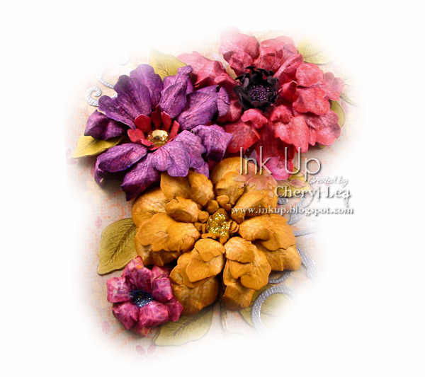
I made all the flowers on this project, and all but the two tiny pink ones are made from the same stamp and die set. The flowers were all stamped onto patterned papers, die cut, inked along the edges, then shaped. There is a close up of the flowers at the bottom of the post.
I've always liked making boxes, but with my new paper cutter, that can cut right through book board, I like it even more. Cutting the parts for the box only takes a few minutes now, and requires very little effort, unlike cutting it by hand with a blade.
Here's a look at the inside. Actually, it has a set of cards inside it now, but they are all cards I've posted before, so nothing new to see there.
The spine of the box is covered in bookcloth with a strip of patterned paper added over that.

Here's a close-up of the larger flowers. You can see the centers much better here. I love how the dark pink one turned out! I used micro beads in the center of that one. The yellow and pink flowers have Stickles centers, and the purple one has a large rhinestone.
These are the smaller flowers. The yellow flower is filled with beads and glitter, and the purple flower has Stickles on the edges of all the petals. The butterfly die cut was covered in Ice Blue Inka Gold, then I heat embossed it with UTEE.

I hope you enjoyed seeing this. You'll probably be seeing a lot more handmade boxes (and books) in the future now! ;)

Thanks for stopping by, and have a wonderful week!

I'm entering this card in the following challenges:
Tiddly Inks Challenge #166: Don't Be Square
613 Avenue Create Challenge #143 : Anything Goes
Penny Black and More September Challenge: Anything Goes
4 Crafty Chicks Challenge #265: Sparkle & Shine
Craft Your Passion Challenge #281: Always Anything Goes

~Hugs,

Supplies Used:

Thanks for visiting my blog!
To have Ink Up delivered to your inbox,
subscribe in the box at the top right of the page.

Timeless Tuesday #258: "Wood" You Be Mine...

Tuesday, February 11, 2014


Time for more Timeless Tuesday goodness!


This week, my sweet friend, Katie, has a really fun challenge for us. She is challenging us to...
I used the Gerber Daisy set for my images, colored them with Copics and cut them with the coordinating Silhouette Cut File. The wings of the butterflies are lifted with CollAll 3D glue. The sentiment, stamped in Teal Zeal Memento Ink, is from the Chrysanthemum stamp set. I was going for a metallic look on the two ornate die cuts on either side of the image, but I'm not sure how well that comes across here. The wood texture on my card is on the panel behind the image. I've got another pic below.


The pic on the left shows the layers and dimension of the images, and the one on the right is the wood textured panel and "metal" embellies that I made using UTEE, before I put the image over it.
It's funny that I made a get well card for this week, since I've been feeling puny, myself! Thanks to everyone for the get well wishes from last week. I'm doing much better! :) The Get Well sentiment in this card is from the Sentimental Favorites stamp set.

Now then, "wood" you please join us in this week's Timeless Tuesday Challenge? I sure hope so. And, remember, you don't have to use Flourishes stamps, but if you do, you get two ballots toward the weekly prize! You can find all the details for the challenge here. And, be sure to check out Flourishes' Gamblers Sale...it's up to 40% OFF--STOREWIDE!

Stop by the rest of the DT's blogs for inspiration and leave them a little blog love while you are there. ;)

~Hugs,
Supplies:

Thanks for visiting my blog!
To have Ink Up delivered to your inbox,
subscribe in the box at the top right of the page.


Timeless Tuesday #256: Pantone Color 2014-"Radiant Orchid"

Tuesday, January 28, 2014

Timeless-Tuesday-New-Logo... Hello fellow Flourishes fans! It's Tuesday and we're here with another fantastic Timeless Tuesday Challenge for you! Have you checked out the latest and greatest Gambler's Sale this week? You don't want to miss this... it's 20% off everything in the store. Things go fast, so shop now to ensure you get all those stamps on your "must have" list! Click here for more details and your shopping code.


FTTC256 PurpleThis week Allison is our hostess and she is challenging you to create using the newest Pantone Color of the year... Radiant Orchid... but any shade of purple will do! According to the Pantone View, "Since 2000, the Pantone Color Institute™ has been designating a Color of the Year to express in color what is taking place in the global zeitgeist. A color that will resonate around the world, the PANTONE Color of the Year is a reflection of what people are looking for, what they feel they need that color can help to answer. Not necessarily the hot fashion color of the moment, but a color crossing all areas of design which is an expression of a mood, an attitude, on the part of the consumers." Have fun using purple in your creations this week!

Personally, I don't usually pay much attention to the Pantone Color of the Year. Actually, I didn't care for the colors they chose over the past two years, at all. But, this year is different. Wow! Radiant Orchid is a gorgeous color! I even like the name. :)  So...create a card using this year's Pantone Color of the Year? Noooo problem!

I stamped the iris image, from the new Flowers for Jan stamp set, on Flourishes Classic White Cardstock, using Memento Tuxedo Black Ink, then colored it with Copics, using Prismacolor pencils to do some shading. After die cutting the image with a Nobel [sic] Rectangles Spellbinders die, I masked it, then colored it with my Copic Air Brush while still in the die. The tilted yellow layer was cut and embossed with the same die set.
I kept the inside subdued and simple. After that eye-popping card front (and yes, it is that vivid IRL, too!), I thought your eyes might need a breather. :)

This week, we have asked the Design Team to join us in celebrating the color purple. Take a moment and leave some lavender love on each one of our designers this week!

Okay, now it's your turn! I hope you'll play along! I can't wait to see how everyone takes on this challenge!

You don't have to use Flourishes stamps, but if you do, you get two ballots toward the weekly prize! You can find all the details for the challenge here.

Thanks for stopping by, and have a wonderful, PURPLE week!

I'm entering this card in the following challenge:
613 Avenue Create Challenge #56: Anything Goes

~Hugs,

Supplies Used:

Thanks for visiting my blog!
To have Ink Up delivered to your inbox,
subscribe in the box at the top right of the page.

Timeless Tuesday #253: Get In Shape With a New Release!

Tuesday, January 7, 2014

Hello all and welcome to a very special kick off to Flourishes' January Release! Not only are we ushering the new release in with a fun-filled Timeless Tuesday Challenge but we are showcasing a set designed to honor Flourishes' owner and founder.

INTRODUCING....

FlowersForJanGraphic

Wisteria, Peonies and Bearded Iris -- all three of these flowers are favorites of Flourishes' founder and owner Jan Marie Caruso. Sentimentally illustrated by Marcella Hawley, these beautiful blooms honor the lady at the helm at Flourishes. Three breathtaking flowers paired with three beautifully scripted words and five accent words. This 4" by 6" set is sure to be one you reach for just to send creations to friends far and wide for any and all occasions!


For the first Timeless Tuesday Challenge of 2014, my good friend, Katie, is challenging us to "Get in Shape!" That is...get your card in shape! Whew! That's so much easier than getting ME in shape! ;-)
Isn't that peony a beauty? I stamped it on Classic White Cardstock with Tuxedo Black Memento Ink, die cut it using the out-of-the-box technique, colored it with Copic markers, and did my shading with Prismacolor pencils. It is popped up on the card base with foam squares. The card base is from Flourishes Candy Pink Paper Collection (the Sweet Tart shade), and I cut it with the Spellbinders Gold Majesty Circles die, adding a sprinkling of Stickles for some subtle sparkle. I backed the base with white cardstock that I first dry embossed with a Swiss Dot embossing folder. To tone the white down just a little bit, I inked the embossing folder with Memento Angel Pink Ink before embossing, then afterward, I spritzed a silver Shimmer Spray over it. I made a seam binding and twine bow and topped it with a clear button.
The inside sentiment is from the Flowers for Jan stamp set, also. Because I like to be able to stand my cards up, I trimmed a little bit off the bottom of the back panel of the card. This keeps it from rocking or tilting, even though it is only balancing on a small point on the front of the card.

Would you like to win this set along with the other two sets being released this month? All you need to do is play along with us!!! We have a special treat for you today -- two actually! First, in honor of Jan Marie and this very special set, Flourishes' Senior Design Team is joining along in this challenge to give you double the inspiration! As you hop around getting inspired on ways to "Get In Shape", don’t forget to try to figure out….

Mystery-Blogger-Graphic

Hidden among the Design Team’s blogs today is our Mystery Blogger of the day. Comment on her blog and you could be chosen to win today’s set! The more you comment, the better your chances of winning.
So, get hopping, and "get in shape!" And, remember, you don't have to use Flourishes stamps, but if you do, you get two ballots toward the weekly prize! You can find all the details for the challenge here.

~Hugs,

Supplies Used:

Thanks for visiting my blog!
To have Ink Up delivered to your inbox,
subscribe in the box at the top right of the page.

Just a Note: Desk Notes & Box

Tuesday, December 17, 2013

This is my last post today...I Promise! This is not a Silhouette project, but one that I designed myself.

I recently saw a pretty box of desk notes, and wanted to see if I could replicate it for one of my DD's teachers. This box is made of very heavy, doubled chipboard. Each part is cut separately, rather than creasing and folding the corners and joints. Because of the design on the dp that I positioned to be on the top of the box, I could have left the top unadorned, however, to help the top stay closed, I wanted to add something to it, to help weigh it down. So, I made a large Tattered Blossom flower rimmed with Stickles, and flanked it with leaf die cuts and smaller flowers. And, of course, shiny sequins, for sparkle. :)

The small opening in the front is to allow you to pick up a sheet easily.


For the notes, I filled the box with squares cut from nice, linen textured writing paper, and stamped 1 of 6 different butterfly designs in the corner of every sheet, in different colors. I wrapped them with a belly band and topped that with a decorative die cut. The text is a Flourishes stamp, and the butterflies are Stampin Up!

Thank you SO much for visiting my blog--especially if you popped in for all 5 of my posts today! And, may you and your family have a Merry and Blessed Christmas!

I'm entering this project in the following challenge:

~Hugs,
 
Supplies:

Thanks for visiting my blog!
To have Ink Up delivered to your inbox,
subscribe in the box at the top right of the page.

Roses are...Yellow

Monday, June 3, 2013


No, I am not a stalker! Even though this is, yet again, another card CASEd from one of Cindy Lawrence's cards. I can't seem to help myself. ;) Here's her gorgeous card:

bb8ac09c0cae6b99e4b8dc7458cd45be
It is so beautiful, with all the details, trims and borders, that when I first saw it as an CASE option in Flourishes Designer CASE Challenge, I didn't, even for a second, consider it. I mean, just look at that ruffled ribbon, and those punched sides! But, it just kept calling to me (I love a real challenge, and this one definitely was that, for me), so I finally decided to give it a try. 
And...I did it! I even got my sides punched evenly and was able to get the ribbon ruffled! What a fun card to make!

Here's a look at the inside.

Thanks for stopping by. I hope you have a wonderful crafty week! :)

I'm entering this card in the following challenges:
Flourishes Designer Focus CASE Challenge: CASE Cindy
Flourishes Timeless Tuesday #222: It's Summertime (use sheer ribbon)
Simon Says Stamp Challenge: Anything Goes
Simon Says Stamp & Show Challenge: Brought to you by the Letter S (sheer ribbon, satin ribbon, Sizzix, summertime)

~Hugs,
 
Stamps: Roses are Red, Life Lines (Flourishes)
Paper: Anthologie (We R Memory Keepers); Annalee (Prima); Coastal cs (Taylored Expressions)
Ink: Copics; Memento; Distress
Dies: On the Edge (Tim Holtz/Sizzix)
Accessories: Garden Rail edge punch (Martha Stewart); Bracket edge punch (EK Success); sheer ribbon; satin ribbon; pearls; Scor-Tape
Size: 5.5" x 6"
Thanks for visiting my blog!
To have Ink Up delivered to your inbox,
subscribe in the box at the top right of the page.

Hollyhocks Birthday

Tuesday, April 9, 2013

I seriously need some birthday cards! Every time I need one, I'm having to make it right then, rather than pull one out of my stash! I don't mind doing that, but it would sure be nice to have the choice of whether to make a new one or not. ;)
That said, I would have made this card anyway. I wanted to try out my newly-learned Copic skills. My DH liked how I colored before the class, and he thinks this is about the same. I, on the other hand, do see a difference, but maybe that's just because I know that this image was colored very deliberately.


Usually, when I've used Copics in the past, I pulled a bunch of markers out randomly and started coloring. I never put thought into color families because I didn't understand the Copic numbering system. Now I do, though, and it makes it so much easier when I'm coloring to know exactly what I want to use and why. For example, rather than testing every single green in my collection to find the right one to use for shading the leaves, I made my choice based on the Copic numbers. Of course, I still tested that marker before committing it to the image, but it ended up being the right choice. I did the same thing for the flowers, too. Yay! (Now I just need to fill in the gaps in my Copic collection so that the orphan markers I already have will have families to belong to, too.)

Isn't this image pretty? I've used it one other time, but that time I colored the flowers yellow so my coloring mistakes wouldn't be so noticeable, and I also only used a small portion of the image so I wouldn't have to color it all. This time I could be fearless! ;) I was even able to make the blue around the flowers fade into the bg rather than only drawing a line around the image. (If the bg behind the image looks pink or purple, it's not. It's actually white, but for the life of me, I couldn't get it to white without messing up the entire pic.)

Oh, right...there is more to this card than the colored image, isn't there. I zig zagged in black around the pink dp, lifted the image off the black mat with crimped cs, then put two pieces of ribbon under the lower right side of the image and added silver half pearls to each one. The Happy Birthday sentiment is from Flourishes Botanical Bookplates stamp set.

On the inside, I sponged Victorian Velvet Distress Ink around the inside edges of the die cut, then stamped the Hollyhock image off the right side of the sentiment panel in the same color so it would fade into the edge. The sentiment is from Flourishes Kids at Play stamp set.

Before I go, I wanted to share one more photo.
I often like to add a little something to bows on gifts. Last night I made this flower, added a sparkly gem in the center (after airbrushing it with my Copic airbrush!), layered several different flourishes behind it, then hot glued it to the bow on this gift. It's really this vivid in real life--practically blinding--but I love all these colors together. And, doesn't the bow look happy! :)

Thank you for stopping by! Have a great day!

I'm entering this card in the following challenge:
Flourishes Summer Lovin' Challenge (FTTCApr13) I used the color pallet from the inspiration pic.

I'm entering the birthday gift bow in this challenge:
Simon Says Stamp...Happy Birthday :-)

~Hugs,

Stamps: Hollyhocks, Botanical Bookplates, Kids at Play (Flourishes)
Paper: Splendid (Authentique)
Ink: Copics; Memento; Distress
Dies: A2 Matting Basics
Accessories: Twill Ribbon; silver pearls; sewing thread
Size: A6 (4.5" x 6.25")
Thanks for visiting my blog!
To have Ink Up delivered to your inbox,
subscribe in the box at the top right of the page.

Friendship Matchbox Dresser

Tuesday, January 8, 2013


Hi Friends! I've been working on a project for the past 4-5 days, and the die I was waiting for arrived early yesterday, so I'm finally finished with it, and am ready to show it to you. You may have seen the tutorial on the Splitcoast Stampers site, but if you didn't, here is a link to it: Matchbox Dresser. And, here's my version...
This was so much fun to make! I used this month's Viva la Verve color inspiration photo to help me choose my color scheme, and at first I wasn't too sure about the eye-popping vividness, but once it was put together, I loved it.  
Here's a better view of the top of the dresser. I like making cards, but it sure is nice to be able to pile on the embellies without worrying about how high everything sticks up. I used the Week 1 Viva la Verve January 2013 sketch for this, but I added so many flowers, it covered up a lot of it. :) I made all the flowers except the green one and the orange flower with the glittery center, and all of them are MFT flower dies except the big blue flower which is a Spellbinders die.
I started making my own pins a few months ago. It's great to be able to match anything. The blue cs behind the pins is what I used to cover both the top and the base of the dresser. It started out a solid color, but I stamped it with a splatter stamp in green ink to give it a little more interest.

The medallions are cut with a new Spellbinders die and backed with a square of the same blue cs that I used for the top and base of the dresser. I left the cs behind the medallions plain. I tried it with the stamped cs, but it took away from the pretty details in the die cut.

Look at all those drawers...24 in all, and aren't they adorable! Remember I said I was waiting on a new die to be able to finish this project? Well, I couldn't have done this project without it. The Stampin Up Matchbox Die has been discontinued, but I found one on ebay and snatched it right up. It sure makes making matchboxes a lot easier, especially since every single box had to be identical. I did have a few complications I had to work out, like how to get a 12" x 12" piece of cs to work on a die that is 13" long, but once I got all the "figuring" out of the way, I was able to work pretty fast. (Patty Bennett's YouTube video here, is a must-see if you have this die).

My biggest problem with this project was the drawer pulls. In the tutorial for the dresser, Lydia used Tim Holtz Hitch Fasteners, which have been discontinued (due to high demand, he is bringing the fasteners back in 2013, but I needed them NOW.) I searched high and low to try to find hitch fasteners somewhere else, and found out that they are used in leather work and are called Sam Browne Studs. But...then, I saw that they are about $2.00 apiece, and I needed 24, so that option was totally out for me. I thought about just gluing something to the front of each drawer, but, nah, I like to make things hard for myself, so I ended up getting some pretty beads, figuring (there I go, figuring again) that they would be easy to attach since they have holes in them. Not so. Those suckers were almost a deal-breaker for this entire project! By the time I was finished making 24 drawer pulls--not attaching them, just making them--I thought my fingers were going to split open, even though I used several pair of pliers to do it. But, in the end, it was worth it, and after making 24 of them, I think it will be easier the next time I do it. Want to see how I attached them?

This is what is on the inside of the box, directly behind the bead. The black disc is just two layers of black chipboard glued together, and the wire is a head pin. I ran the wire through the bead, then using round nose pliers, I bent both ends of the wire so that they hugged the bead and came together in the back. Then, I gave the wires one twist to keep the wires together, and trimmed the wire so that, once it was inserted through the drawer front and black disc, only 1/4" showed. Then, I used the round nose pliers again and curved each wire down until the ends pressed into the chipboard, which help the bead snugly against the drawer front. It sounds pretty easy, but I had to make a few complete drawers before I got all the logistics straight. If you do this, you need to attach the dp strip to the front of the drawer and the disc to the inside of the drawer AND punch a hole through them before ever assembling anything. Then, assemble the entire box, except for the back end of the drawer. Then, attach the "handle." After that you can finally finish assembling the drawer--24 times!

One last thing about the construction of this project. In the future, I am going to add one layer of chipboard in between the base and drawers, and between the top and drawers, because when you open the top drawers or the bottom drawers they drag against the top and the base. 

I can't say that this project was easy, but without a doubt, I can say it was worth it. Good thing, because I promised my DD that I'd make her one, too! 

I made this dresser for a friend who has invited me to stay with her this weekend for a stamp club meeting at Tybee Island. These are the same girls I met in Greenville in September at a stamping convention, only this time, I get to meet the rest of the group, AND stamp with them! Inside each drawer is a little surprise: chocolate, buttons, ribbon, charms, more chocolate, a few of my pins...well, you get the idea. I hope she likes it!
I'd like to enter this project in the following challenges:

Thanks for stopping by my blog, and have a fantastic week!

~Hugs, 

 
Stamps: Sweetness of Friendship (Flourishes); Splatter (Impression Obsession)
Paper: Breathe Paper Collection (Prima); Bright Pattern Pack (Colorbok) 
Ink: Memento; Distress; gold caligraphy pen
Dies: Loopy Bloom, Lg Royal Rose, Rolled Daisy, Rolled Mum (MFT); Fantastic Flourish Three, Medallion Five, Daisy Heads (Spellbinders)
Accessories: Felt; brads; beads; Perfect Pearls Mist; button; Perle Cotton; head pins; chipboard scraps; flowers; pearls & gemstones; Distress Stickles Dry Glitter
Size: 6" x 6" x 5" high
Thanks for visiting my blog!
To have Ink Up delivered to your inbox,
subscribe in the box at the top right of the page.