It's Your Day!

Monday, April 29, 2013

Are you ready for a new week? I spent a fun weekend with friends, so I'm rested and ready to roll!
I'll bet, just by looking at the front of this card, you'd never guess that it is a wedding card. I don't think I would, and I wasn't even sure that's what I wanted to do with it at first, but the Flourishes Timeless Tuesday Challenge this week is weddings, so I decided to go with it, and I'm glad I did. Once it was all put together, I really liked it.

I colored the image with Copics, added some white gel pen dots inside some of the flowers, then cut it with a circle die, using the out of the box technique, so I wouldn't lose any of the image. All the three-dimensional dots behind the image were inspired from this week's Play Date Cafe challenge color palette photo. I wanted the bg to look similar to the photo also, so I started with gray cs, then spritzed it with several colors of Dylusions Ink Spray before added the dots.
In keeping with the dotty card front, I used plenty of dots inside the card, also. ;)

I've always liked the Floral Ovals die, but often hesitated to use it because I always had to clean out the little pieces that got stuck in the die, but not this time. I've got a good tip for you when using intricate dies that will keep pieces from getting stuck inside the die and will also immediately release the entire die cut easily: Save the poly bags that are in cereal boxes and add them to your die cutting sandwich between the paper and the die. You might be able to do this with just one layer of the poly, but since I didn't get all the crumbs out of the bag first, I just flattened it, using a double layer. I've been using regular wax paper, sometime even four layers, and while it does help some, it's not nearly as good as the cereal bags. Give it a try. I think you'll soon be eating a lot more cereal! ;)

Thanks for stopping by, and have a fab week!

I'm entering this card in the following challenges:
Flourishes Timeless Tuesday #217: Wedded Bliss (FTTC217)
The Play Date Cafe Challenge #179 (PDC179)
Color Throwdown #239 (CTD239)
Simon Says Stamp Challenge: Anything Goes

~Hugs,

 
Stamps: Summer Blossom, Hollyhocks, Wedded Bliss (Flourishes)
Ink: Copics; Memento; Distress; Dylusions Ink Spray; white gel pen
Dies: Std Circles Sm, Classic Scalloped Circles Sm, Classic Ovals Lg, Floral Ovals (Spellbinders); Tiny Sweet Scallop (Verve)
Accessories: White embossing powder (Zing); ribbon; twine; Enamel Accents; Liquid Pearls; Pearl Pen; foam dots
Size: A2 (4.25" x 5.5")
Thanks for visiting my blog!
To have Ink Up delivered to your inbox,
subscribe in the box at the top right of the page.

Secret of Nature

Sunday, April 21, 2013

I'm trying to enter two challenges ending in less than two hours, so I'll be brief. ;)

             pic name               pic name
I used another Viva la Verve sketch for this card, made my own background paper for the Simon Says Stamp & Show Challenge, made a frame for the Flourishes Timeless Tuesday Challenge #216, and used the ColourQ #185 color palette.
The bg paper started out as white with teeny little pin dots. I randomly added a music stamp in purple, a thistle stamp in dark pink, sponged a dark teal on the edges of the paper, dragged the edges through water to make the ink run and to curl the edges a bit, then sewed the edges with a wonky straight stitch. The frame was made with a Coke can. I cut it with a square die, cut out an oval opening with another die, embossed the frame, rounded the corners, then colored it with alcohol inks. It is glued to the sentiment panel, which is matted with a black square. I dry embossed the red banner, but it was really stark against the dp's, so I swiped a white paint dauber over it to mute the color.

The inside is pretty simple, and I left it blank because I'm not sure yet what kind of card I want it to be.

Thanks for stopping by. I hope you have a great week!

I'm entering this card in the following challenges:
Flourishes Timeless Tuesday Challenge #216: Frame It! (FTTC216)
Viva la Verve April 2013 Week 3 Sketch Challenge (VLVApr2013)
ColourQ Challenge #185 (CQC185)
Simon Says Stamp & Show: Background

~Hugs,
 
Stamps: Nature's Pace (Stampin Up)
Paper: Basics White Paper Pad (Basic Grey); Madeline (Prima)
Ink: Distress; Adirondack Alcohol Ink
Dies: Banner Stacklets 1 (Taylored Expressions); Blossom, Labels 18, Classic Squares Sm, Classic Ovals Sm (Spellbinders)
Accessories: Paper Lace II embossing folder, Decorative Tile embossing folder (Cuttlebug); ribbon; crystal; Stickles; acrylic paint dauber (Adirondack); sewing thread; Coke can
Size: A2 (4.25" x 5.5")
Thanks for visiting my blog!
To have Ink Up delivered to your inbox,
subscribe in the box at the top right of the page.

A Father's Direction


I'm still coloring up a storm since my Copic classes, and haven't stopped to make too many cards, lately,. :) but I did finally use one of the images for a Father's Day card.
I used the Viva la Verve April 2013 Week 1 sketch, Color Throwdown #238 color palette, and Simon Says Stamp theme of "Travel," for this card. After coloring the image, I used a cloud stencil to create clouds, and some Copic Opaque White and a toothpick to create the ocean spray. The burlap started out as a creamy white, but I changed that with my Copic Air Brush System by spraying it yellow, then toned that down a little bit with brown. I like the aged look. I layered several die cuts, did some sewing, and lifted the image panel and mats with layers of crimped cs--all of this on a yellow card base.

For the brads, which were bright yellow brass, I colored them with a dark brown Copic marker, and randomly added a few spots of black. Since the dye won't absorb into metal, it was sticky afterward, so I just sprayed it with a light coat of clear sealant, which fixed it right up. :)
I didn't have much of the argyle dp left, but wanted to use it on the inside, too, so I cut thin strips and created a simple frame for the navy cs square. The sentiment layer die cut is the same design that is layered behind the black pinstripe layer on the front. I stamped the sentiments, glued the die cut to the navy cs, and added Distress Stickles around the perimeter. I don't use Distress Stickles very often, but they are perfect for a masculine or distressed card.

That's it for the card, but I have one more fun thing to share with you...

A couple of weeks ago I made a blue fabric-covered box, and it was so much fun to make, I just had to make another one. This one is for my DD. I love all the bright, fun colors, and she does, too. It matches her room perfectly! I went a little crazy in the fat quarter department of the fabric store last week, and now I'm all set to make several more of these. :)  They are really sturdy, and make great gift boxes! A link to the tutorial I used is on my Blue Box post.

      pic name                       pic name              
 pic name        pic name  

Thanks for stopping by, and enjoy the rest of your weekend!

I'm entering the Father's Day card in the following challenges:
Viva la Verve April 2013 Week 1 Sketch Challenge (VLVApr2013)
Simon Says Stamp: Travel/Cityscapes
Color Throwdown #238 (CTD238)

~Hugs,
 
Stamps: A Guiding Light, Seaside Life (Flourishes); Simply You (Ali Edwards)
Paper: Little Black Dress (Basic Grey); Hattie Papers (My Mind's Eye); Flourishes Classic White (Flourishes)
Ink: Copics; Copic Opaque White; Spica Pen; Memento; Distress Ink; Stampabilities
Dies: Std Circles Lg, Classic Ovals Sm, Splendid Circles, Labels 18 (Spellbinders)
Accessories: Cloud Stencil (Inky Antices); burlap; Copic Airbrush; brads; Distress Stickles; sewing thread; foam dots
Size: 4.75" sq.
Thanks for visiting my blog!
To have Ink Up delivered to your inbox,
subscribe in the box at the top right of the page.

Swallowtail Courage

Thursday, April 18, 2013

Hi Friends! I hope you've had a good week so far. Ours has been interesting, but extremely trying. We have honeybees in one of our exterior walls! What a frustrating mess! We thought they were just in a garage wall, and that the beekeeper had gotten all of them a few days ago, but they are back with a vengeance!!!

But, on to my card...
The design is from this week's My Favorite Things Wednesday Stamp Club (MFTWSC120), and the color palette is from The Play Date Cafe Color Challenge #178 (PDCC178). It was a simple card to make, but it may not be obvious how I did it, so here are the deets: The card base is gray. I heat embossed the beautiful Swallowtail image on white cs, with a bright pink embossing powder then randomly swiped a Squeezed Lemonade Distress Ink pad directly on the cs. The edges were sponged with Memento London Fog. The layers behind the image are gray, then yellow, then pink. The final, largest layer is gray cs, dry embossed with a Bubble embossing folder. Then I used a silver and a white paint dauber along the outer edges, finishing it with Black Soot Distress Ink.

For the flags, I die cut them, then folded them along the yellow twine, gluing the ends together, and I added just a tiny bit of glue to the back to hold them in place over the image, but I left the pointy ends of the flags loose. The clear gems were added to each flag with Glossy Accents.

On the inside, I used a smaller butterfly stamp randomly on white cs, punched the corners with a Stub Corner Chomper, stamped the sentiment in gray ink, then again in pink ink, and sponged yellow, then black ink along the edges. It is mounted to pink dp and the yellow pearls in the corners are dots of Liquid Pearl.

Oh, what I would give for a butterfly infestation rather than honeybees!

Thanks for stopping by, and have a fantastic, bee-free weekend. :)

I'll be entering this card in the following challenges:

My Favorite Things Wednesday Stamp Club #120 (MFTWSC120)
The Play Date Cafe Color Challenge #178 (PDCC178)

~Hugs,

Stamps: Swallowtail, Papillon Potpourri (Stampin Up); Words of Wisdom (Verve)
Ink: Distress; Memento; Versamark
Dies: Banner Stacklets 1 (Taylored Expressions)
Accessories: Bubble Embossing Folder (Sizzix); embossing powder (Recollections); twine; mini round gems (Recollections); Stub Corner Chomper; Liquid Pearls; acrylic paint
Size: A2 (4.25" x 5.5")


Thanks for visiting my blog!
To have Ink Up delivered to your inbox,
subscribe in the box at the top right of the page.

One Blue Box

Friday, April 12, 2013

I know I said I wouldn't have another post until next week, but I had forgotten about a box that I made and wanted to share with you. I first saw it on Pinterest, and the link took me to the Art Gallery Fabrics blog. Not only do they have gorgeous fabrics, they also have a weekly feature called Fat Quarter Gang that has great tutorials using fabric.

But, that's enough talking! On to the photos....

Since you can go straight to the tutorial, very little explanation is needed by me, so here are a few pics of the box:

The lid fits on the box perfectly!
A view of the inside.

Even the inside of the top looks pretty.
I'm a sucker for pretty handmade boxes! ;)

On few notes on the tutorial: be sure to double check the measurements for the parts of the box, as well as the fabric. Two of the cardstock circles need to be cut slightly smaller than stated and one of the fabric strips needs to be cut slightly larger than stated in the tutorial.

Now, I am done here until Monday. Thanks for stopping by and have a fantastic weekend.

~Hugs,

Thanks for visiting my blog!
To have Ink Up delivered to your inbox,
subscribe in the box at the top right of the page.

Purple Snowdrops

Thursday, April 11, 2013

Okay, I'll just go ahead and get this out of the way: I know there is no such thing as a purple snowdrop. I'm not sure if I've ever seen one in real life, but I Googled it to see how to color the image, and I found out that they are always white. But, using my artistic license, I decided that today snowdrops can be purple. :)

I am enjoying coloring so much more since my Copic classes last weekend. One of the things I learned was that the paper you color on really does make a big difference in how well your finished image looks. I used Flourishes Classic White cs here, and it colored beautifully. After coloring this snowdrop stamp, also from Flourishes, I masked it and stamped the text over it, then sponged Distress Ink inside the die. I like having a little bit of sparkle, so I used Diamond Stickles in the corners. The bg is a dark olive colored cs which I dry embossed, sponged with Seedless Preserves Distress Ink, spritzed with yellow and lime green Dylusions Ink Spray, and painted the edges with white acrylic paint. The meandering stitching is done with dark purple thread. 

For the card design, I used the Viva la Verve April 2013 Week 2 sketch. It's a very simple sketch that calls for two small elements just to the right of a rectangle. I chose to use clay embellishments that I made awhile back. They were made with a bronze colored clay which didn't work for me here, so I colored them a deep purple with my Copic airbrush, added a few metallic gold highlights with a calligraphy pen, then sanded lightly to expose a little bit of the bronze color. Finally, I gave them a light coat of a clear spray sealant and hot glued them to the cs.
For the dark green layer on the inside of the card, I dry embossed, sponged with the dark purple Distress Ink, did simple, straight stitching, and let that be it. The lime green layer is a Romantic Rectangles die cut, and the personalization layer was cut with a craft knife, inside the same die, from white cardstock. I sponged Crushed Olive Distress Ink lightly over the cs, used Seedless Preserves ink along the edges and also for the sentiment. The snowdrops were stamped with a light lavender Memento ink.

That's it for me for a few days. I'll be heading to Savannah tomorrow for another stamping weekend with my friends, so I don't think I'll be posting anything else until Monday. In the meantime, thanks for stopping by and have a fantastic, crafty weekend! 

I'll be entering this in the following challenges:
Simon Says Stamp: April Showers and/or Spring Flowers
Viva la Verve! April 2013 Week 2 Sketch Challenge (VLVApr2013)

~Hugs,

 
Stamps: Botanical Bookplates Vol. 1, Sweet Nature (Flourishes); Signature Greetings II (Papertrey Ink)
Paper: Flourishes Classic White
Ink: Copics; Distress; Memento; Dylusions Ink Spray
Dies: A2 Matting Basics, Romantic Rectangles (Spellbinders)
Accessories: Abstract Flower edge punch (EK Success); Decorative Tile embossing folder (Cuttlebug); acrylic paint dauber (Adirondack); clay embellishments; Copic airbrush; clear sealant; Stickles; sewing thread
Size: A2 (4.25" x 5.5")
Thanks for visiting my blog!
To have Ink Up delivered to your inbox,
subscribe in the box at the top right of the page.

Hollyhocks Birthday

Tuesday, April 9, 2013

I seriously need some birthday cards! Every time I need one, I'm having to make it right then, rather than pull one out of my stash! I don't mind doing that, but it would sure be nice to have the choice of whether to make a new one or not. ;)
That said, I would have made this card anyway. I wanted to try out my newly-learned Copic skills. My DH liked how I colored before the class, and he thinks this is about the same. I, on the other hand, do see a difference, but maybe that's just because I know that this image was colored very deliberately.


Usually, when I've used Copics in the past, I pulled a bunch of markers out randomly and started coloring. I never put thought into color families because I didn't understand the Copic numbering system. Now I do, though, and it makes it so much easier when I'm coloring to know exactly what I want to use and why. For example, rather than testing every single green in my collection to find the right one to use for shading the leaves, I made my choice based on the Copic numbers. Of course, I still tested that marker before committing it to the image, but it ended up being the right choice. I did the same thing for the flowers, too. Yay! (Now I just need to fill in the gaps in my Copic collection so that the orphan markers I already have will have families to belong to, too.)

Isn't this image pretty? I've used it one other time, but that time I colored the flowers yellow so my coloring mistakes wouldn't be so noticeable, and I also only used a small portion of the image so I wouldn't have to color it all. This time I could be fearless! ;) I was even able to make the blue around the flowers fade into the bg rather than only drawing a line around the image. (If the bg behind the image looks pink or purple, it's not. It's actually white, but for the life of me, I couldn't get it to white without messing up the entire pic.)

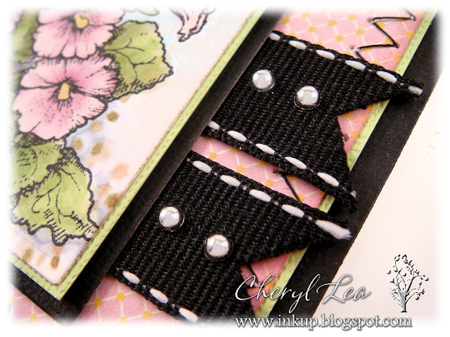
Oh, right...there is more to this card than the colored image, isn't there. I zig zagged in black around the pink dp, lifted the image off the black mat with crimped cs, then put two pieces of ribbon under the lower right side of the image and added silver half pearls to each one. The Happy Birthday sentiment is from Flourishes Botanical Bookplates stamp set.

On the inside, I sponged Victorian Velvet Distress Ink around the inside edges of the die cut, then stamped the Hollyhock image off the right side of the sentiment panel in the same color so it would fade into the edge. The sentiment is from Flourishes Kids at Play stamp set.

Before I go, I wanted to share one more photo.
I often like to add a little something to bows on gifts. Last night I made this flower, added a sparkly gem in the center (after airbrushing it with my Copic airbrush!), layered several different flourishes behind it, then hot glued it to the bow on this gift. It's really this vivid in real life--practically blinding--but I love all these colors together. And, doesn't the bow look happy! :)

Thank you for stopping by! Have a great day!

I'm entering this card in the following challenge:
Flourishes Summer Lovin' Challenge (FTTCApr13) I used the color pallet from the inspiration pic.

I'm entering the birthday gift bow in this challenge:
Simon Says Stamp...Happy Birthday :-)

~Hugs,

Stamps: Hollyhocks, Botanical Bookplates, Kids at Play (Flourishes)
Paper: Splendid (Authentique)
Ink: Copics; Memento; Distress
Dies: A2 Matting Basics
Accessories: Twill Ribbon; silver pearls; sewing thread
Size: A6 (4.5" x 6.25")
Thanks for visiting my blog!
To have Ink Up delivered to your inbox,
subscribe in the box at the top right of the page.

One Pantry, Organized

Monday, April 8, 2013

I normally post cards on my blog, but I enjoy seeing how other people organize their homes and thought you might, too, so after I spent a few days last week organizing my kitchen pantry, I thought I'd share it with you. :)

(If you just want to see the before and after photos, I have them together at the bottom of the post.)


I tend to be fairly organized overall, but my method is usually organized chaos. This is my pantry just before I emptied it completely out. I had designated each shelf for specific types of items. Not too bad, but you can probably tell I didn't stick too well to my original plan.


My kitchen is a medium shade of avocado green, and the inside of my pantry, including the ceiling, was, too, which made it pretty dark inside, even with the light on. So, I painted the whole thing white (with some help from my DH, who tackled the high corners for me). I've been seeing a lot of decorative stenciling inside pantries, so I decided to give that a try, too. I figured, even if I messed it up really bad, I could just paint over it again, and most of it wouldn't show anyway once I put everything back inside. I had a hard time finding stencils I could live with. These are pretty, but not exactly "me." But, I was on a roll, you know, and I wanted to get it finished, so I went with it. ;) The dragonfly image at the top of the post is a close up of one of the stenciled images. I originally wanted them to be yellow, but that barely showed up, so I improvised. I grabbed a dauber of teal acrylic paint from the craft room and re-stenciled the entire thing, leaving a good bit of the yellow showing through for a distressed look. You know I love distressing!


We have very high ceilings throughout our home, and the ceiling of this pantry is 10' up. It ends up being quite a lot of wasted space, but people often look up at our ceilings because of the height, so I stenciled a couple of dragonflies on the pantry ceiling for a bit of interest. You can see here, that I also stenciled the sides of the pantry, too, although not as much as the back.


You may have noticed in the before picture that the top shelf was warped. I'd never noticed it before, but once I did, it really bugged me, so I replaced it with a new, straight one. Also, I despise wire shelves, so I covered foam core board with contact paper and lined the shelves with them. Now, when I look in my pantry, each shelf stands on its own, rather than having to see everything above and below them, too.


And, here's the finished pantry! I decided to add an additional higher shelf, even though it covered up a lot more of the stenciling because I almost always opt for function over fashion. We'll have to use a tall step ladder to get to it, but since I'm using it to store unopened items that are waiting their turn to be used, it's not that inconvenient. I have a much larger pantry in the basement (that also needs a major overhaul) where I can keep these kind of things, but you know that saying, "out of sight, out of mind"? Well, I end up throwing a lot of stuff out just because I forget it's down there.

In case you're wondering how I got my pantry this neat and have so much extra space, I'll tell you my secret.... I threw out all the expired food. It shocked me to see how much there was. I ended up hauling out two trash bags of old food that had accumulated in the back of the pantry where I couldn't see it anymore. I even had an old jar of Tang that expired eleven years ago!!! OMGosh, we've only lived in this house for four years, so I brought it here in the move, and we don't even drink Tang! I think I used it in a craft project at some point. Do you have anything like that in your pantry? I'm going to keep a much closer eye on mine from now on. Of course, I also combined multiple packages of food that were opened (but not expired!), and bought several air tight containers to corral like items and to store dry goods in that took up a lot of space in their original packaging. I threw out those boxes that were on the floor for chip bags, and will put those in the green basket now. I'm hoping the floor will stay nice and empty from now on. It looks so much nicer, don't you think? :) The only problem I have with my pantry now is that I find myself opening the door a lot more--just to look at it. Now, instead of wasting space, I'm wasting time! I'll be glad when the new wears off. ;)


 BEFORE:                                                                            AFTER:
pic name                     pic name

I love my new pantry! We had a huge mess in the kitchen for three days until I could get it finished, and I was exhausted from painting inside such a cramped space--especially up in the ceiling, but I have to say it was totally worth the effort.

What's the oldest expiration date in your pantry? Can you top my eleven-year-old Tang? :D

Simon Says Stamp and Show has a "Fly" challenge this week. Since I've got birds and dragonflies stenciled on my walls, I think this qualifies!!!

I'll be posting a card next time. Thanks for stopping by, and have a great week!

~Hugs,

 
Thanks for visiting my blog!
To have Ink Up delivered to your inbox,
subscribe in the box at the top right of the page.