Pear Notecard Set & Matchbox Style Box

Friday, March 9, 2012

Hi Blog Friends! I hope you've had a great week and are looking forward to an equally fun weekend. School is out here today and Monday, so we have a long weekend of sorts--always nice. I hope to have a few new cards to share with you over the next day or two. I'll start with a little notecard set.

Flourishes Timeless Tuesday #159, this week, is an inspiration photo. The challenge is to choose at least three colors from the photo in your creation. I chose the greens, gold, and brown.

This also fits nicely with the DYSU Challenge #62: Go Green.

For this notecard set, I used the gorgeous Pears stamp set for the image and the Cherries and Peaches stamp set for the sentiment on the box.

For the cards, I used a white card base, folded in half and cut with a Lacy Square die. I positioned the fold inside the die to maintain the fold. On a separate piece of white cs, I stamped the pears in black ink, then colored them with my Copics. I used a Labels Large Spellbinders die to cut the images out and sponged Distress Ink along the inside edges of the die while it was still on the cs. I adhered the image layer to a dark green layer that I had distressed with my Distrezz-it-All and sponged with Distress Ink. For the light green layer, I cut a rectangle to fit on the white base, rounded the lower edges with a Corner Chomper, sponged a little Distress Ink along the edges, then glued the other layers to it, finally gluing the entire thing to the card base. The three green sparkly dots are Stickles (of course!) :)
I left the front of the card sentiment-free so it could be used for any occasion, and the inside is blank, for a personal note.

The box is matchbox style. I have a tutorial for the box here. To get the height measurement for this box, I stacked the notecards and envelopes up, then measured from the table to the top edge of the stack. For the length and width, I measured one of the envelopes (remember, they are bigger than your cards). I only added about 1/16" to the height measurement since the cards will easily compress to fit in the box, and no more than 1/8" to the length and width so the cards wouldn't move around much in the box.

I decorated the box exactly like the cards, except I added a sentiment.

Because the box is a custom size, everything fit together nicely, and the interior box was just snug enough that it wouldn't fall out easily. However, for presentation, I tied a nice big organza bow around the box, making sure that the sentiment was visible through it.

This set was a lot of fun to make, and even though I was a little concerned about having to color five identical images, and get them all to be presentable, everything turned out fine. It was really good Copic practice, and I can always use more practice coloring!

If you are thinking of making a matchbox style box, I highly recommend that you try my tutorial at least once. There are a few more steps than in some matchbox tutorials because of the ends being doubled over, but because of that, it is sturdy, and makes for a very nice gift box for just about anything--notecards, candy, trinkets...you name it. :)

Well, that does it for me today. Thanks for stopping by, and I hope you have a fun, crafty weekend.

~Hugs,
 
Stamps: Pears, Peaches & Cherries (Flourishes)
Paper: Lime green & dark olive green dp (designer unknown); 110 lb white cardstock for box
Ink: Copic markers; Memento; Distress Ink 
Dies: Lacy Squares, Labels Lg (Spellbinders)
Accessories: Sheer Ribbon (Offray); Stickles; distressing tool; Corner Chomper
Size: 4-Bar (Interior box dimensions: 5.25" x 3.75" x .75")

Thanks for visiting my blog!
To have Ink Up delivered to your inbox,
subscribe in the box at the top right of the page.

Tuesday Morning Sketch Challenge #136: Sweet & Sassy

Tuesday, March 6, 2012


Happy Tuesday, Friends! Yes, happy is a good word for Tuesday because it's time for a new Tuesday Morning Sketch (TMS136). This week's sponsor is Guylou's Inimitability Digistamps, and our very own Marie designed the sketch.
I used the Eve digistamp, and Eve reminds me of the 1970's, with her bellbottoms and giant dangly loop earrings. I had the perfect paper--Hippie Chic, from DCWV--so I decided to paper piece at least part of her outfit. You would think paper piecing would be difficult with a digital stamp, but it's not. For this image, I printed Eve onto a piece of white cs to use as my base. Then I printed the image again onto white paper. I had a piece of cs that had strips of different dp's on one sheet, so I cut out the section I wanted to use, taped it to the white paper, lining up the dividing line between the two different dp patterns with the line on the image just above Eve's knees. I ran the paper back through the printer, printing the exact same image onto the patterned dp, and then cut out the pants from the dp. I did all my Copic coloring before attaching the pants to the image, and I used Copics to add a touch of shadow to the pants.

I used gold and silver Stickles for Eve's earrings and necklace, and for the rest of the card, I used dp from the same Hippie Chic stack. I just love the retro look! I mostly stuck to the sketch, but I really wanted to use the orange plaid cs on this card, so I trimmed my image as much as I could, and added the plaid as an extra layer to frame the image. It completely changed the look of the card, and brightened it up a lot. The "Sweet and Sassy" sentiment is from a Just Rite stamp set called, Topsy Turvy Cakes. I embossed the oval with a navy embossing powder, stamped the sentiment in orange, sponged a tiny bit of color around the inside of the embossed oval, then covered the entire area inside the embossed area with Glossy Accents.

For the inside, I punched a border from the orange plaid dp and attached it to the top of white cs, matted with navy. Then, I stamped a "sassy" birthday cake image and "Celebrate" sentiment (both from the Topsy Turvy set) in the lower right corner. I used a yellow Copic to add just a few bright touches to the flowers on the cake. This would make a great birthday card for a teenage girl, I think.

This is such a fun sketch, and a gift certificate from Guylou's Inimitability Digistamps is up for grabs! Don't you want to play along with us! :) For all the deets, and some fab inspiration from the rest of the team, head over to Tuesday Morning Sketches. You have until Sunday at 8:00 P.M. EST to link your creation. 

I can't wait to see what you create! Thanks so much for stopping by my blog, and have a great week!

~Hugs,
 
Stamps: Eve (Guylou's Inimitability Digistamps); Topsy Turvy Cakes (Just Rite Clear Stamps)
Paper: Hippie Chic (DCWV)
Ink: Copic Markers; Distress Ink; Memento
Dies: Classic Rectangle Large, Classic Scalloped Rectangle Large (Spellbinders)
Accessories: Postage Stamp Edge Punch (EK Success); embossing powder (Stampendous); ribbon; Glossy Accents; Stickles; foam dots
Size: A2 (4.25" x 5.5")
Thanks for visiting my blog!
To have Ink Up delivered to your inbox,
subscribe in the box at the top right of the page.

I've been Liebstered!

Monday, March 5, 2012

Hello Friends! First things first...thank you soooo much for your concern and well wishes for me and my family during our recent storm. Happily, I can report that we made it through unscathed! And, for those of you in the areas that were hit more directly by that huge swath of nature's fury, I hope you were safe through it all, too.

***


Late this afternoon, I saw that I had a nice surprise in my comments. Dotty A honored me with an award--a Liebster Award! I had seen this on blogs, but never knew what it was. Well, if you're wondering, too, here's the scoop:


This award is for bloggers with less than 200 followers, to bring attention to your blog, and increase your following! So, in the spirit of good fun I am passing this award on to five worthy bloggers. Please stop by to visit them, and become a Follower.

Here are the Rules:

1. Show you're thanks to the blogger who gave you the award by linking back to them. (Thank you, Dotty!)

2. Reveal your five picks for the award and let them know.

3. Post the award on your blog.

4. Bask in the love from the supportive people out there in Blog Land!

5. Finally and the best rule of all..........have fun and spread the love!

The five blogs I have chosen are listed below. Click on over to their beautiful sites, look around and don't forget to become a Follower.

Marie at Ink'd Wings
Theresa at My Sassy Cards

Thanks for stopping by, and if you're not a Follower yet, I'd love to have you join me!

~Hugs,

 
Thanks for visiting my blog!
To have Ink Up delivered to your inbox,
subscribe in the box at the top right of the page.

Beach Wedding: A Moving Sea

Saturday, March 3, 2012

Hi Friends! This will be a really quick post. We are camped out in our basement right now, waiting out the storm, but I wanted to get this post in before completely shutting everything down.

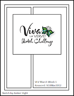
I mentioned the other day that my SIL asked me to make a beach-themed wedding card for her. Well, my stamps arrived, so I was able to get it for her in time. I used Kathy's Lily Pad Palette Color Challenge for the colors, and the Viva la Verve March 2012 Week 1 sketch. The Simon Says Stamp Challenge is Anything Goes, so I'll be entering this card there, too.


And, here's my card:
I finally bought a roll of Eclipse paper, and was able to easily mask the shells so I could stamp them on top of each other. I colored them with Copics, added Glossy Accents to the inside part of the shells that would be shiny, and used a little Ultra Fine Flower Soft as sand. After heavily distressing the edges of the image panel, I used sponges and Distress Ink to color the background. I cut a couple of die cuts with a Foliage Spellbinder die, then added Sage Ultra Fine Flower Soft to that, too, before adhering it to the edge of the image panel. The pink bg cs is embossed with a swirl pattern. 

The quote on the front of the card is one I found on the web. I could have printed it directly onto the cardstock, but I prefer to make a rub on with a transparency. I like a softer, stamp-like look, rather than a crisp, printed look on my text. I stamped a small seashell image in the center of the quote, in Antique Linen, and sponged Tea Dye ink on the edges of the Curvy Bookplate die cut. The tag die cut behind the quote was a taupe color, and I spritzed it with Perfect Pearls mist to give it an aged and slightly shiny look, but also to strengthen it. I've noticed that wetting cs then heating with my heat gun, often seems to stiffen the cs, and that particular die cut was a little flimsy. 


For the inside of the card, I distressed a square of watercolor paper, sponged Distress Ink along the edges, then stamped the sentiments.

I better go...sounds like the storm is back. Thanks for stopping by my blog, and have a wonderful weekend!

~Hugs!
 
Stamps: Seaside Life (Flourishes); Wedding (Inkadinkadoo)
Ink: Copic markers; Distress Ink; Memento
Dies: Curvy Bookplate (Verve); Foliage, Fancy Tags Two (Spellbinders)
Accessories: D'Vine Swirls embossing folder (Cuttlebug); seam binding (Hug Snug); pearls; pearl brad; Glossy Accents; Perfect Pearls Mist; Ultra Fine Flower Soft
Size: 5" square
Thanks for visiting my blog!
To have Ink Up delivered to your inbox,
subscribe in the box at the top right of the page.

Dream Journal

Thursday, March 1, 2012

Hi there, Friends! I've got a cute, simple project to share with you today. It's a blank notebook from Michael's dollar bin that I gussied up with a little country flair. I used the My Favorite Things Wednesday Stamp Club #61 sketch, the theme from Flourishes Timeless Tuesday Challenge #158: "Country Comfort," the ingredients and theme of "Take Note" from the Taylored Expressions February Key Ingredients Kit Challenge, and a torn layer for the Tuesday Throwdown #87 Challenge: Paper Tearing.


This is my first Key Ingredients kit and I wasn't sure what to expect, but I LOVE it! It's so great to have everything already color coordinated. Everything on this project came from the kit except for the dark brown cs, a Pearl Pen, and the metal embellies on the corners.
The stamp is from the Taylored Expressions Vintage Dreamer set (you can find the set on the same page as the Kit Club subscription information. I think you can still get the stamp set right now for half-off if you are a Key Ingredient Kit Club subscriber. I inked the stamp with several colors of Distress Ink, using sponge daubers, the added Pearl Pen dots and Stickles just on the rose image. I also stamped another image from the set (a floral motif) in the lower right corner of the gingham paper. The brown cs behind the image was embossed with a Woodgrain embossing folder and I tore the edges to give it a more rustic feel. I adhered all the pearls and metal embellies with Glossy Accents to make sure they stay on.

This is so much cuter than it was before I covered it, and no more difficult than making a card! :)

Well, time to head out to the car rider line. Thanks so much for stopping by my blog today!

~Hugs,
 
Stamps: Vintage Dreamer (Taylored Expressions)
Paper: Lost & Found Two (My Mind's Eye); Watermelon CS (Taylored Expressions)
Ink: Distress Ink; Memento
Accessories: Woodgrain embossing folder (Sizzix); pearls (Want 2 Scrap); Flora & Fauna Metal Accents (K&Co); Stickles; Pearl Pen; sewing thread
Size: 5.25" square
Thanks for visiting my blog!
To have Ink Up delivered to your inbox,
subscribe in the box at the top right of the page.