Showing posts with label Flourishes. Show all posts

Flourishes Stamps For Sale

Tuesday, November 8, 2016

It's time to get started on that craftroom sale I mentioned last week! I will have Pinterest boards set up for the items I have for sale. If you see something you want, just email me at inkup.blog at gmail.com with a list (first-come, first-served) and I'll get back to you with your cost, including shipping. I will be taking payments on PayPal.

Most of the items I am selling are used and are not in their original packaging. Some stamps are stained, but that does not affect how they stamp. All sales are final.

I'm starting with Flourishes stamp sets today. Look for Spellbinders dies in the next few days.

Click here for the list: Flourishes Stamps for Sale

Thanks for stopping by, and have a wonderful week!

~Hugs,


Thanks for visiting my blog!
To have Ink Up delivered to your inbox,
subscribe in the box at the top right of the page.

Things of Nature

Tuesday, September 29, 2015

Hello Friends! A quick post here to share my latest creation. I'm pretty excited about this one because I made it using my brand new Kutrimmer 1071 paper trimmer! I've wanted one ever since I used one at a bookbinding bookcamp in Athens, but the cost was prohibitive. But, I found a brand new one on Ebay last week for a great price and the seller just happened to be within driving distance, so I was able to pick it up and get started using it right away! 
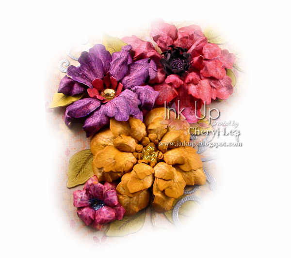
I made all the flowers on this project, and all but the two tiny pink ones are made from the same stamp and die set. The flowers were all stamped onto patterned papers, die cut, inked along the edges, then shaped. There is a close up of the flowers at the bottom of the post.
I've always liked making boxes, but with my new paper cutter, that can cut right through book board, I like it even more. Cutting the parts for the box only takes a few minutes now, and requires very little effort, unlike cutting it by hand with a blade.
Here's a look at the inside. Actually, it has a set of cards inside it now, but they are all cards I've posted before, so nothing new to see there.
The spine of the box is covered in bookcloth with a strip of patterned paper added over that.

Here's a close-up of the larger flowers. You can see the centers much better here. I love how the dark pink one turned out! I used micro beads in the center of that one. The yellow and pink flowers have Stickles centers, and the purple one has a large rhinestone.
These are the smaller flowers. The yellow flower is filled with beads and glitter, and the purple flower has Stickles on the edges of all the petals. The butterfly die cut was covered in Ice Blue Inka Gold, then I heat embossed it with UTEE.

I hope you enjoyed seeing this. You'll probably be seeing a lot more handmade boxes (and books) in the future now! ;)

Thanks for stopping by, and have a wonderful week!

I'm entering this card in the following challenges:
Tiddly Inks Challenge #166: Don't Be Square
613 Avenue Create Challenge #143 : Anything Goes
Penny Black and More September Challenge: Anything Goes
4 Crafty Chicks Challenge #265: Sparkle & Shine
Craft Your Passion Challenge #281: Always Anything Goes

~Hugs,

Supplies Used:

Thanks for visiting my blog!
To have Ink Up delivered to your inbox,
subscribe in the box at the top right of the page.

To Get Joy

Tuesday, March 25, 2014

Brrrrr! It's cold here...AGAIN! I'm feeling a little like Olaf in the movie, Frozen, "Let's Bring Back Summer!" (Isn't he adorable?) I seriously need some warm weather! :)
For my card today I colored a springtime hyacinth image with Copic markers, then die cut it using the out-of-the-box technique. The centers of the flowers are dotted with white Liquid Pearls. The image is matted with a decorative circle die cut of heavy brown shimmer cardstock and a white doily. For the sentiment, I heat embossed it with a fine detail embossing powder on a circle of vellum. It's always a challenge to attach vellum so that the glue or tape doesn't show, so I just ran the circle through my Xyron so that the entire piece had adhesive on it, then adhered it on top of the image. The pink bg cs was embossed with a Decorative Stripes embossing folder. A few pearls on the die cuts and on the bg, and I was done. 

Thanks for stopping by. Stay warm!!!

I'm entering this card in the following challenges:
Simon Says Monday Challenge: Transparent
613 Avenue Create Challenge #64: Anything Goes

~Hugs,
 
Supplies: 

Thanks for visiting my blog!
To have Ink Up delivered to your inbox,
subscribe in the box at the top right of the page.

Happy Spring!

Thursday, March 20, 2014

Happy Spring!!! I don't know about you, but I have been ready for Spring for a long time! Now we just need some warm spring weather to coordinate with the calendar! :)


For this card, I used the Viva la Verve March 2014 Week 1 Sketch, as well as the colors from the color portion of the same challenge. As usual for me, I turned the sketch sideways, and in place of the 3 fishtail banners, I used a branch die cut.

I also added a warm gold color into the color palette, as I'm wishing for warm spring days to hurry up and get here!


I first stamped the nest image in Desert Sand Memento Ink, then roughly colored it with Inktense pencils. With a paintbrush and water, I blended the color. After it dried, I inked the stamp up again with Espresso Truffle Memento Ink and stamped over the colored image. Since I stamped the image in such a light color originally, the lines disappeared in the Inktense coloring, and I didn't have to worry about lining up the stamp perfectly the second time. I used Prismacolor pencils to add subtle shading, and a Spica Atyou clear pen for shimmer on the leaves and eggs. For the frame, I used the Medallion Two D-Lites die set and cut 4 frames, layering them to give it some lift, then I die cut the colored image with just the outer die so it would fit behind the ornate die cuts. For the branch, I cut it once in brown cs, and once in a green dp, which I shaded with Peeled Paint Distress Ink and a Spica Atyou clear pen. I trimmed all the leaves off the green die cut and glued them to the brown one. The sentiment is stamped on an oval die cut, and I sponged Scattered Straw inside the die before removing the cs. I hand cut the oval behind it. On the card base, I put 1/4" Scor-Tape on the top and bottom edges, then coated them with white glitter. I did some sewing on the background dp, then glued it to the card base and added all the other elements, including a little bow on the sentiment oval, and a few Swarovski crystals.
On the inside, I sponged a Labels 28 die cut with Scattered Straw Distress Ink, then stamped the floral image and sentiment in Memento inks and added light color to the image with Prismacolor pencils.

I can almost hear the birds chirping! ;)

I'm entering this card in the following challenges:

~Hugs,
 
Supplies:

Thanks for visiting my blog!
To have Ink Up delivered to your inbox,
subscribe in the box at the top right of the page.

Light it Up!

I tried my hand at another CAS card, and used colors that lean toward the masculine side.
This was so easy...just stamp, color, dry emboss a couple of wavy lines, and add some glitter with Scor-Tape. I could get used to this! Oh, and it doesn't show in the picture, but I used a clear Wink of Stella pen to add a subtle shimmer to the lanterns.

I'm entering this card in the Simon Says Stamp Wednesday Challenge: Glitter It

~Hugs,

Supplies Used:

Thanks for visiting my blog!
To have Ink Up delivered to your inbox,
subscribe in the box at the top right of the page.

Timeless Tuesday #262: It's a WASH!

Tuesday, March 11, 2014


Happy, Happy Tuesday! Aaannnnd, we're back...with another Timeless Tuesday Challenge!
Deborah is our hostess this week, and she has challenged us to get out those rolls of Washi tape and actually use them! I don't know about you, but I rarely use Washi tape. They are in a drawer, so I often forget I have them, but even when I do remember, I have a hard time figuring out where to use them. So, this was a real challenge for me. But, I persevered, and before I knew it, I was a Happy Camper!!! ;)

This card is not my usual style. I love fun, bright colors, but I don't use them in large doses in my cards very often. But, I recently got some Gelatos and wanted to give them a try, and since they are all bright colors, that's what I went with. :) I used the MFT Wednesday Stamp Club Sketch #166 for my layout. The bright bg paper is my first attempt with Gelatos. I just scribbled a few colors from the MFT Color Palette Challenge #3 (had to use pink and blue to make the purple color since there isn't a purple in the Gelato set I have) onto a piece of textured watercolor paper then used a paint brush and water to blend them. After it dried, I mixed some gesso and water and did a little dripping and dropping with a water dropper. For the image, I first used the S'More Fun Silhouette Cut File to cut out the camper and that cute little banner, stamped the images with Memento Tuxedo Black ink, then colored them with Copics. All those gold areas on the camper are meant to look like rust, but I'm not sure it comes across that way. ;) The vellum circle behind the image was dry embossed with a blueprint embossing folder, and the sentiment was heat embossed with black ep. The kraft strip in the center of the card has a piece of Washi tape on it. 

I almost didn't even show the inside of this card, it's so plain. But, I thought I'd show an easy way to spruce up the inside with hardly any effort at all. The strips of color on the top and bottom of the white die cut are simply from the die cut negative that was left over after cutting the bg for the front of the card. All I had to do was distress the edges with Distress Ink to match the front of the card, then glue them onto the white panel and trip the excess. Barely any waste at all, and it took all of 2 minutes to finish the inside.

So, now that it's your turn, I hope you'll play along! I can't wait to see how everyone takes on this challenge! I'm hoping to get inspired on new ways to use Washi tape!!! For the challenge, you don't have to use Flourishes stamps, but if you do, you get two ballots toward the weekly prize! You can find all the details for the challenge here.

Also, take a moment to be inspired by all our designers' blogs, and be sure to leave some love for them, too! :)
~Hugs,

Supplies Used:

Thanks for visiting my blog!
To have Ink Up delivered to your inbox,
subscribe in the box at the top right of the page.

Timeless Tuesday #261: MASKuerade!

Wednesday, March 5, 2014

Hello, and welcome back to another Timeless Tuesday (on Wednesday this week) Challenge! 


This week, the super-talented Allison is hosting a MASKuerade! And here's how you play along...


I went with the stencil option for my card...
I used the Viva la Verve February 2014 Week 3 sketch, turned sideways (see, I told you...another turned sketch!) for the layout, and the crackle design on the background was made with a stencil and molding paste that I colored with Distress Reinkers. I used Flourishes Calla Lilies stamp set for the image and sentiment, stamping both with Memento Tuxedo Black Ink. The image is colored with Copic markers. I ran the flourish die cuts through a Xyron, then coated them in white glitter.
On the inside, I punched a Footlights border and added a strip of dp diagonally across it. On the personalization panel, the lily image is stamped in Angel Pink Memento Ink.

I hope you'll join us for the MASKuerade this week! And, remember, you don't have to use Flourishes stamps, but if you do, you get two ballots toward the weekly prize! You can find all the details for the challenge here.

Be sure to take a moment to be inspired by the rest of the team, and leave some blog love for them, too! :)
On a personal note...Sympathy cards are always hard to make, but this particular sympathy card was made with an unbelievably heavy heart. My dear friend, Linda, had recently been diagnosed with cancer, and I knew I was going to eventually need a card for her family. I thought I was being proactive by making the card early, as I knew it would have been difficult, emotionally, for me to make it after she was gone, but the day after I finished the card, Linda suddenly passed away. I can't believe she is gone, but I am so grateful to have had her in my life. She was an amazingly strong, caring woman, and she had a wicked sense of humor that could make you laugh, even, or maybe especially, on days when all you wanted to do was cry. She was one of a kind, and I will miss her.

Thanks for stopping by, have a wonderful week! And, to all of you, my blog friends, a great BIG virtual HUG!

I'm entering this card in the following challenges:
Viva la Verve February 2014 Week 3 Sketch Challenge
Simon Says Stamp Wednesday: Anything Goes With Pearls
Curtain Call Inspiration Challenge: Perfectly Peach
613 Avenue Create Challenge #61: Anything Goes
Paper Issues: Tip-Toe Through the Tu-lips

~Hugs,

Supplies Used:

Thanks for visiting my blog!
To have Ink Up delivered to your inbox,
subscribe in the box at the top right of the page.

Timeless Tuesday #260: < = >!

Tuesday, February 25, 2014

Hello, all you Flourishes Fans! Did you hear the news? There is a serious buyer for Flourishes!!! Yay! I SO hope it goes through...don't you? :D Well, while we are waiting to find out, let's play! :)


I'm your hostess for this week's Timeless Tuesday Challenge, and I wanted to give everyone a super easy challenge to work with.


So, here it is...< = >! Or, in non-math terms, Less = More! What does that mean, you ask? Well, simply create a card with a stamped image, but NO coloring! It doesn't have to be a CAS card, but if you really want to embrace the < = > theory, go for it!
For my project, I decided to make a boxed set of cards using some of my favorite Flourishes floral images. And, nothing shows off an image like white on kraft! 
I used Flourishes Classic Kraft cardstock, stamped the images with white pigment ink, then heat embossed large floral images from the Gerber Daisies, Sweet Peas, and Picking Wildflowers stamp sets. In the lower right corner, I stamped sentiments with Versamark ink, then heat embossed them in blue, pink, and yellow embossing powders. The sentiments came from the Sweet Peas, Picking Wildflowers, and Butterflies & Blossoms stamp sets. After cutting the upper right corner at an angle, I sponged Walnut Stain Distress Ink over the sentiments, up the right side of the card, and in the upper left corner. 

pic name pic name
pic name pic name
pic name pic name
On the inside, I used coordinating, but smaller, floral images, stamped in Versamark ink, but I didn't emboss them. The Picking Wildflowers set doesn't have a smaller image, but the Garden Picks set had a wildflower image that worked great with it.
To finish off my set, I made a box, using my envelope punch board. Jennifer McGuire has a great tutorial on how to do this. Before assembling it, I heat embossed the Sweet Pea image on the flap and on the back side. Then, tied it up with a polka dot ribbon.
Here's a look at the back of the box. Notice the slits that are cut for the ribbon to go through. This is so that when the box is untied, the ribbon won't fall off. 

Now, it's confession time! Remember I said I wanted this to be an easy challenge? HA! It was anything but that for me. Look at all my attempts to heat emboss the images:


Can you see what went wrong??? I had a major embossing powder fail! Before I figured out that it was the embossing powder, and not the cardstock, ink, or even operator error, I tried several brands of kraft cs, and a couple of dark colored cardstocks, too. I also tried stamping with Versamark ink, and with white pigment ink. No matter what I did, THIS is what I got...

Have you ever seen anything like this??? I'm not exactly sure what happened, but I think my embossing powder was absorbing dye from the cardstock because there was nothing in the powder before it was heated. I tested it on white cardstock, and it turned out beautifully. So, to make this project, after working on it unsuccessfully for hours, I finally went out and bought more embossing powder. Problem solved! ;~) But my < = > challenge sure was a lot more difficult for me than I had planned. Fortunately, though, I loved the finished set. So, aside from the ep fail, I have to say...Less=More=Easy Peasy! And, I like that equation!

I hope you are inspired, and will play along with us this week! I can't wait to see what you make! And, remember, you don't have to use Flourishes stamps, but if you do, you get two ballots toward the weekly prize! You can find all the details for the challenge here.

Be sure to visit the rest of the team to see how they've turned "Less" into fabulous "More!"
Thanks for stopping by, and have a crafty week!

~Hugs,

Supplies Used:

Thanks for visiting my blog!
To have Ink Up delivered to your inbox,
subscribe in the box at the top right of the page.

Timeless Tuesday #259: Polka Dots

Tuesday, February 18, 2014


Flourishes's Gambler's Sale is up to 50% off--STOREWIDE! Better hurry, as things are flying off the shelves! But, for now, let's talk Timeless Tuesday!


This week, Jenny is our hostess, and she has given us a fun, but simple challenge.  Just use polka dots! See...Easy Peasy!
I had so much fun making this card! I did some stamping with two different Flourishes stamp sets, some heat embossing, paper piecing, distressing, and sewing, and used six different dp's, including, of course, a cute polka dot pattern, and came up with a sweet card to surprise a friend whom I enjoy coffee with after we drop the kids off at school. Well, sometimes it's just coffee, but often it includes breakfast, maybe a trip to the mall, occasionally even lunch, before the "morning" is over. ;) She's a great friend, that's for sure, and I love spending time with her! The Viva la Verve February 2014 Week 1 sketch, turned on it's side, was perfect for this card, as I thought the two circle layers looked like coasters. I used the So Distressed stamp set (still in stock, so hurry, if you want it!) to add coffee rings and a few splotches to them in Gathered Twigs Distress Ink. For the cups, I first cut them on my Silhouette, using Flourishes Grab a Cup Silhouette Cut File, and stamped the image (unfortunately, already out of stock) in Rich Cocoa Memento Ink. Then I stamped the cup images onto 2 different dps in Rich Cocoa ink, fussy cut the pieces and glued them to the white stamped base. The cute little coffee cup "logo" on the cups is part of the stamp set. I just colored it with Copic markers. It's hard to see in the photo, but I used CollAll 3-D glue to raise just the outer edges of the cups to give them a little bit of dimension. I stamped the coffee beans, also in the Grab a Cup set, multiple times on the newsprint dp, and heat embossed the "COFFEE" text in brown ep, adding the ellipsis with a Versamark pen.
On the inside, I stamped the sentiment with Rich Cocoa ink, adding the dots with a Sharpie marker, then punched zig zag strips from four of the dp's to jazz it up a bit. I sponged Vintage Photo ink around the edge of the panel, and over the exposed white edge to the left of the zig zag strips.

So let's all get DOTTY! ;D  You don't have to use Flourishes stamps, but if you do, you get two ballots toward the weekly prize! You can find all the details for the challenge here.

Want to see how DOTTY the rest of the team is? Well, just check them out here:

~Hugs,


Supplies Used:

Thanks for visiting my blog!
To have Ink Up delivered to your inbox,
subscribe in the box at the top right of the page.